Janma - The Science of Purity
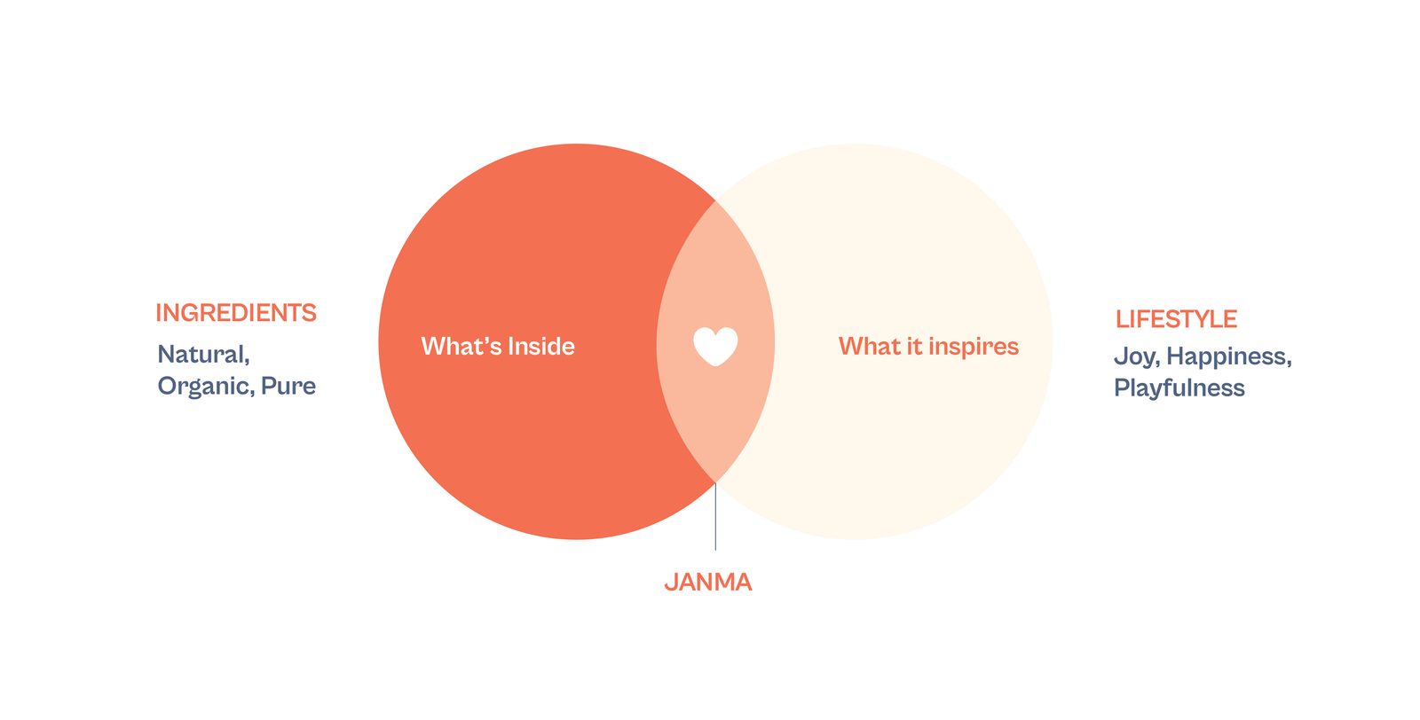
Janma was born to reimagine baby and junior care for today’s discerning parents. The baby care aisle has long been dominated by “cute-ified” packaging – playful illustrations, over-saturated colours, and whimsical motifs that often overshadow the core concern: safety and efficacy. Parents today, however, are looking beyond cutesy aesthetics. They want evidence, transparency, and products rooted in science that they can trust on their child’s skin.
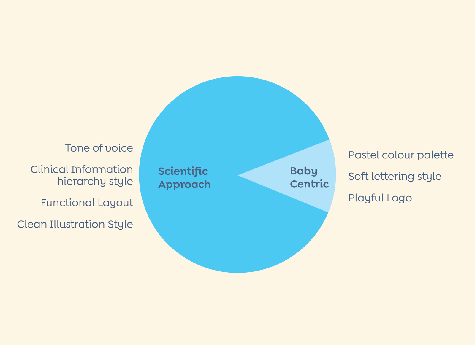
Janma bridges this gap. A modern, ingredient-led baby and junior care brand, it brings science, simplicity, and clarity to the category. With this rebrand, Janma set out to stand apart as a credible, ingredient-led baby and junior care brand – breaking free from the overly playful codes of the category, creating packaging that communicates science, safety, and care at first glance, and balancing seriousness with warmth to remain both trustworthy and child-appropriate.
What Parents Really Want
We conducted deep research with parents and caregivers, mapping their purchase behaviour and decision drivers. Three core insights emerged:
- Parents are label-readers. They want to understand what goes into a product, looking for transparency, ingredient science, and dermatological credibility.
- Science is the new reassurance. Parents value clear, clinically backed claims over whimsical promises. The absence of clutter is interpreted as honesty.
- Balance is key. Packaging needed to maintain a tone of care and softness—too clinical would alienate children, too playful would erode trust.
These insights formed the backbone of Janma’s positioning: credible, ingredient-led, and design-forward.
Simplicity as Strategy
We intentionally stripped away the decorative excess common in the category.
The clean layout allowed functionality, claims, and ingredients to take centre stage.

Packaging
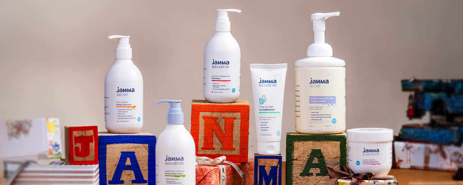
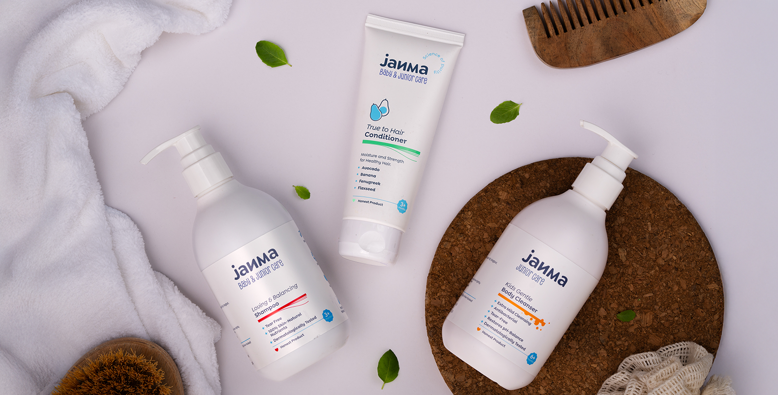
The label architecture was designed for at-a-glance clarity, with the brand identity prominent at the top for recognition, the product type immediately visible for quick selection (e.g., Baby Cleanser, Shampoo, Conditioner), key claims and benefits highlighted in a crisp, bullet-point format, and ingredient cues reinforced through minimal iconography.
Instead of loud illustrations, we used playful yet minimal cues directly tied to each product’s form and function – bubbles for cleansers, strands for shampoos, and blobs for creams. This subtle system created instant recognition while maintaining aesthetic restraint.

Minimal, Meaningful, and Modern
Ingredients like aloe vera, avocado, and coconut were highlighted through a playful yet clean illustration style reinforcing Janma’s science-backed ethos while signalling purity and natural care. The packaging also adopted a balanced tone of voice – reassuring yet approachable, communicating efficacy without jargon and warmth without gimmicks.
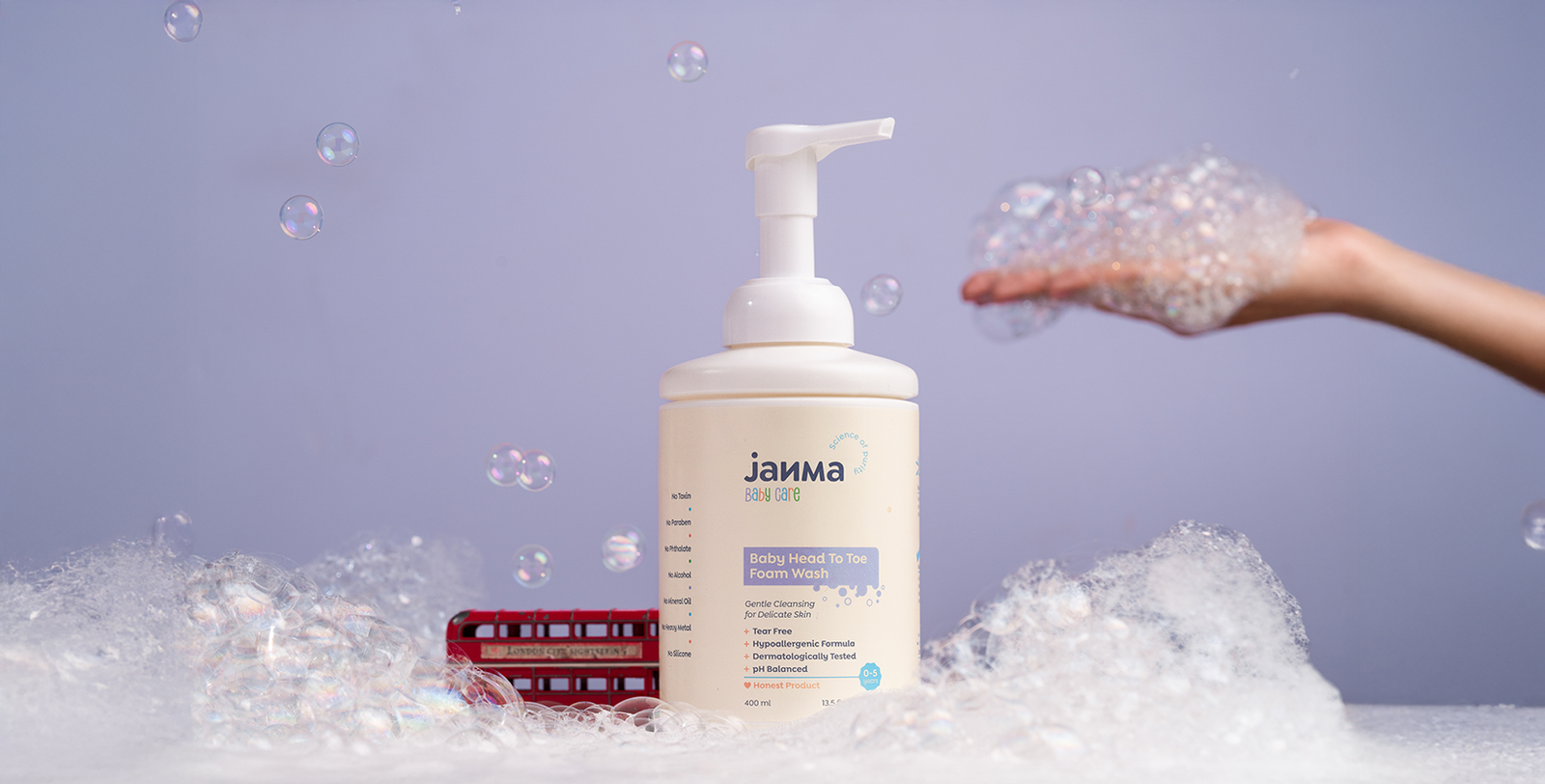
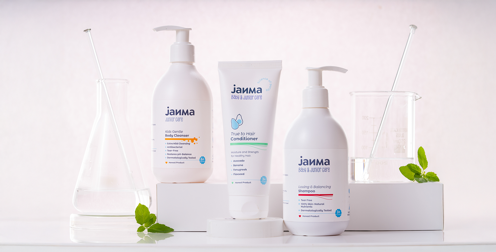
We extended Janma’s identity into a cohesive visual world, using soft, minimal ingredient icons, credibility-building seal marks such as Science of Purity, All Age Group, and Born 2018, and a soft blue-and-white palette that signalled safety, purity, and trust. This system elevated Janma from just another baby care brand to a design-forward, trustworthy name in the category.


Packaging With Purpose
Janma successfully repositioned itself as a modern, science-backed baby and junior care brand. Its clean, minimal packaging builds immediate trust with parents through clarity and transparency, differentiates itself on shelf by cutting through the noise of over-decorated packaging, and creates a lasting identity system adaptable across product lines and future expansions. By focusing on simplicity, clarity, and science, Firebrand helped Janma craft not just packaging, but a strategic brand language – one that speaks directly to parents while caring for the world of children.


