Millimo- Food that cares
Building a healthy brand in a cluttered kids’ food category
The children’s food category is dominated by two extremes.
On one end are overly playful brands built on mascots and sugar-driven indulgence.
On the other are serious health brands that feel clinical, restrictive and unappealing to children.
For Millimo, the challenge was clear:
– Create a millet-based kids nutrition brand
– Communicate clean-label credibility to parents
– Make the food exciting enough for children to enjoy
– Build a brand that could scale across products
The brand needed to balance nutrition and joy without leaning too far in either direction.
Research & Insights
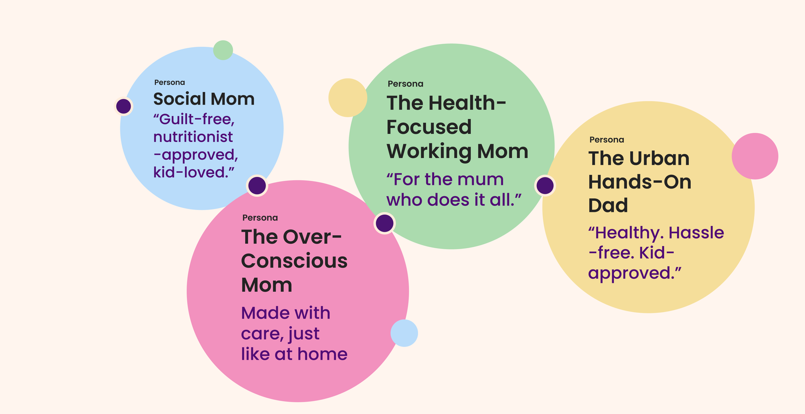
Our research revealed three key truths shaping parental decisions.
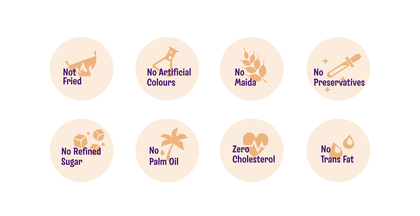
Parents prioritise ingredients
Today’s parents actively read labels and prefer clean, transparent ingredients over artificial additives.
Children choose what they enjoy
Even the healthiest food fails if children don’t find it fun or appealing.
The category relies on cliches
Kids food brands heavily depend on: animal mascots, cartoon graphics, exaggerated sweetness cues
This space is visually overcrowded and lacks ingredient-led honesty.
Strategic Direction
Millimo needed to sit at the intersection of:
Credibility for parents and Excitement for children
The brand would lead with millets as the hero ingredient, while creating a playful identity system that made healthy food feel approachable.
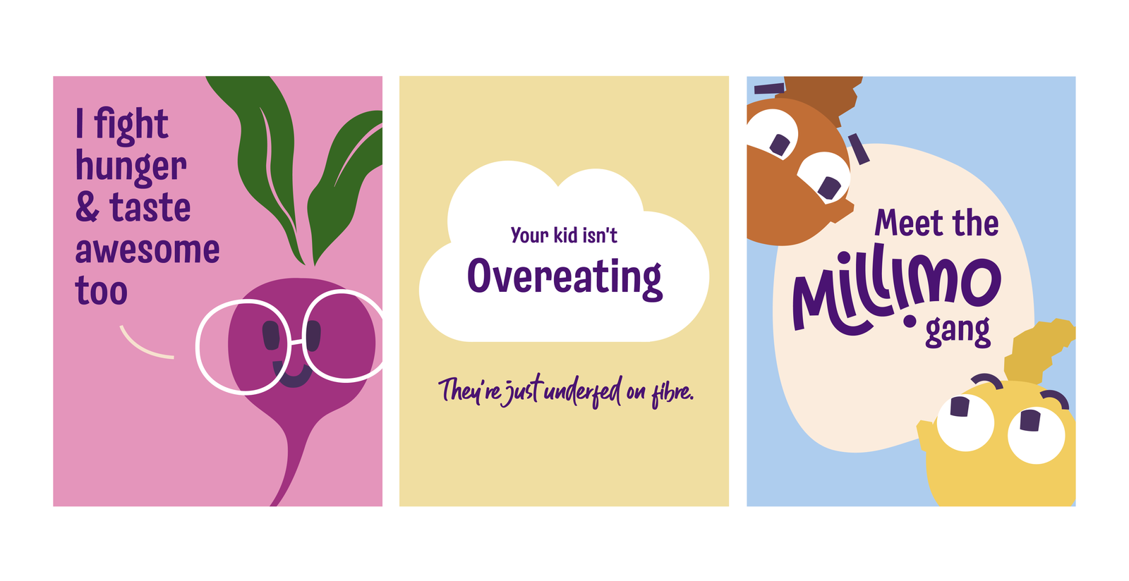
Brand Idea
Food that cares.
A brand built on nourishment, honesty and thoughtful nutrition – designed to help parents raise a healthier generation.
Naming
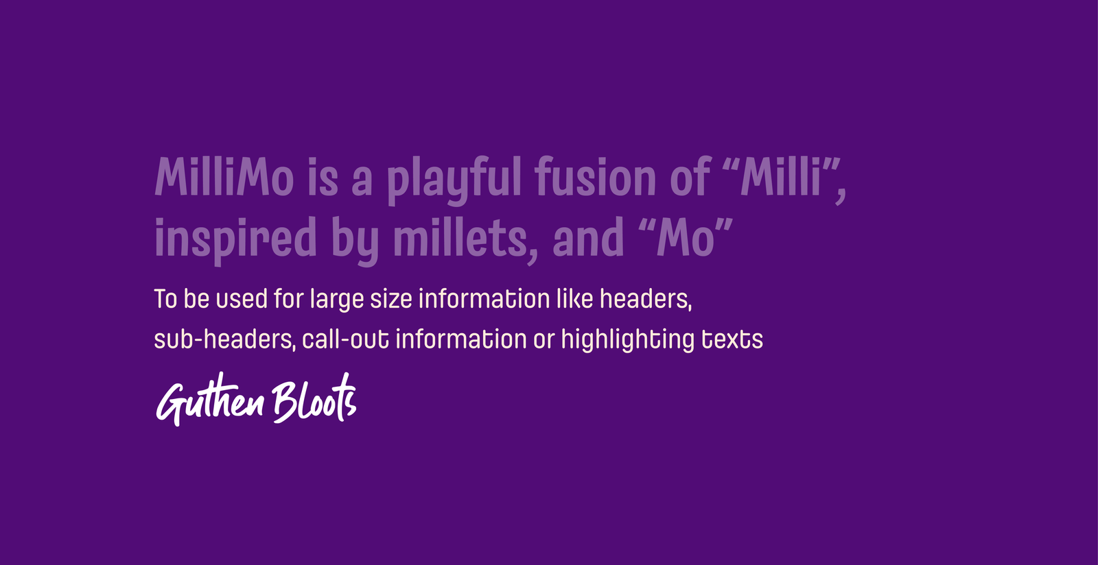
The Birth of Millimo
Millimo is a playful fusion of:
“Milli” — inspired by millets and “Mo” — representing movement, momentum and more.
The name captures a fresh, energetic approach to millet-based nutrition.
It is rhythmic, memorable and friendly, making it easy for both children and parents to connect with the brand.
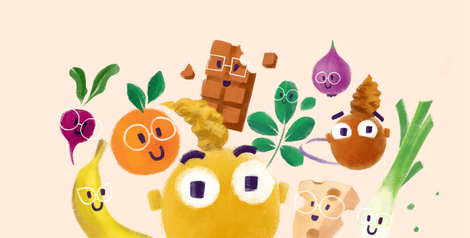
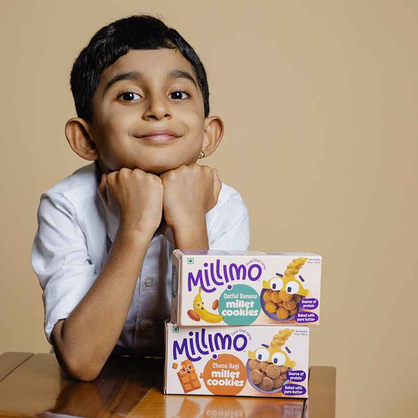
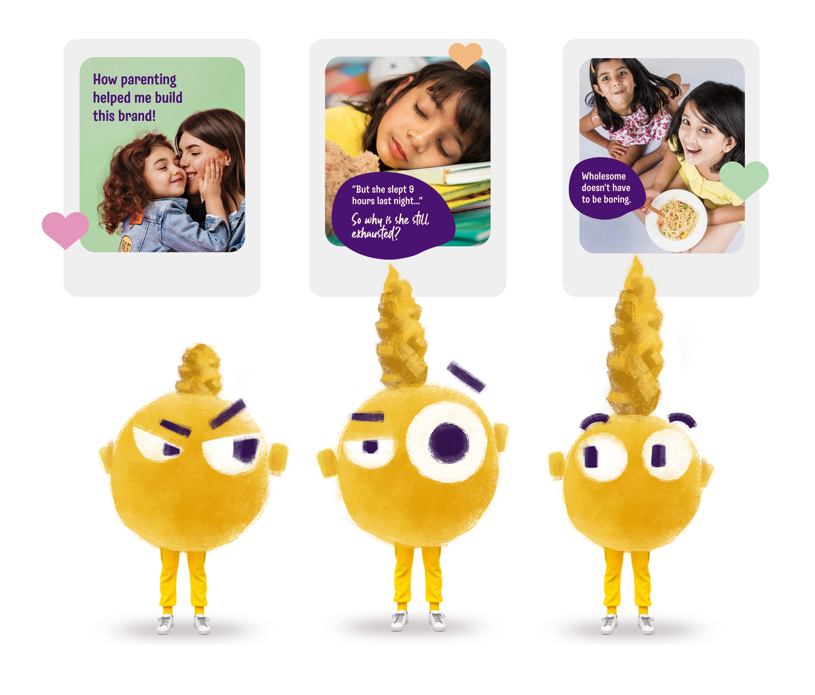
Building out the Mascot
To bring the brand to life, we introduced
Mo — a friendly millet character.
Mo acts as a guide through the brand world, transforming healthy ingredients into playful storytelling.
Rather than relying on generic cartoon mascots, Mo embodies the spirit of nourishment, curiosity and fun.
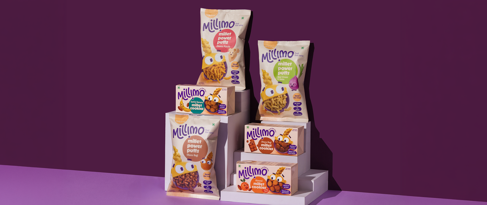
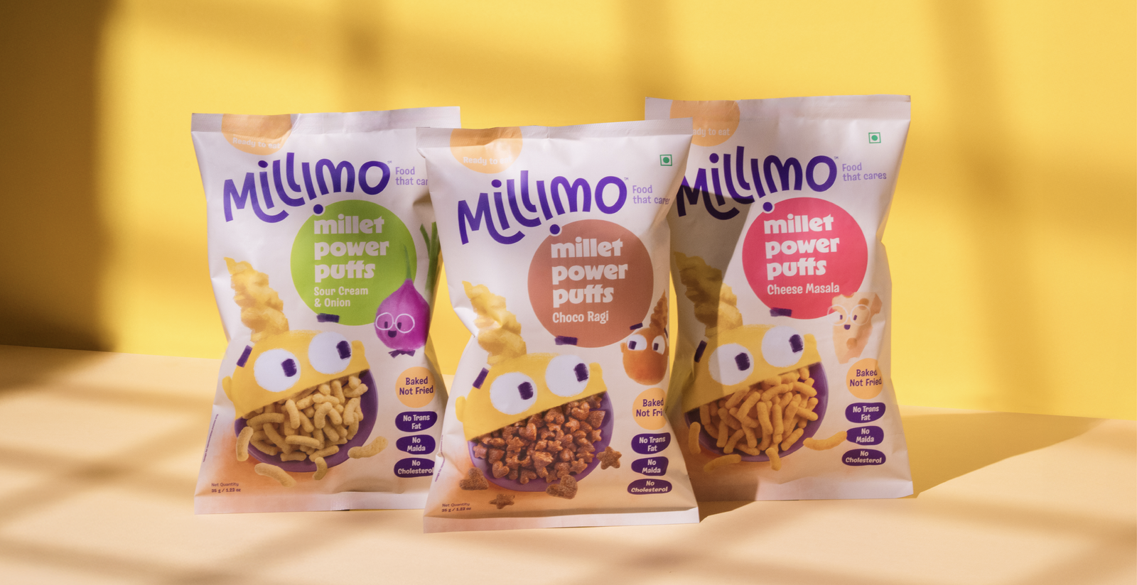
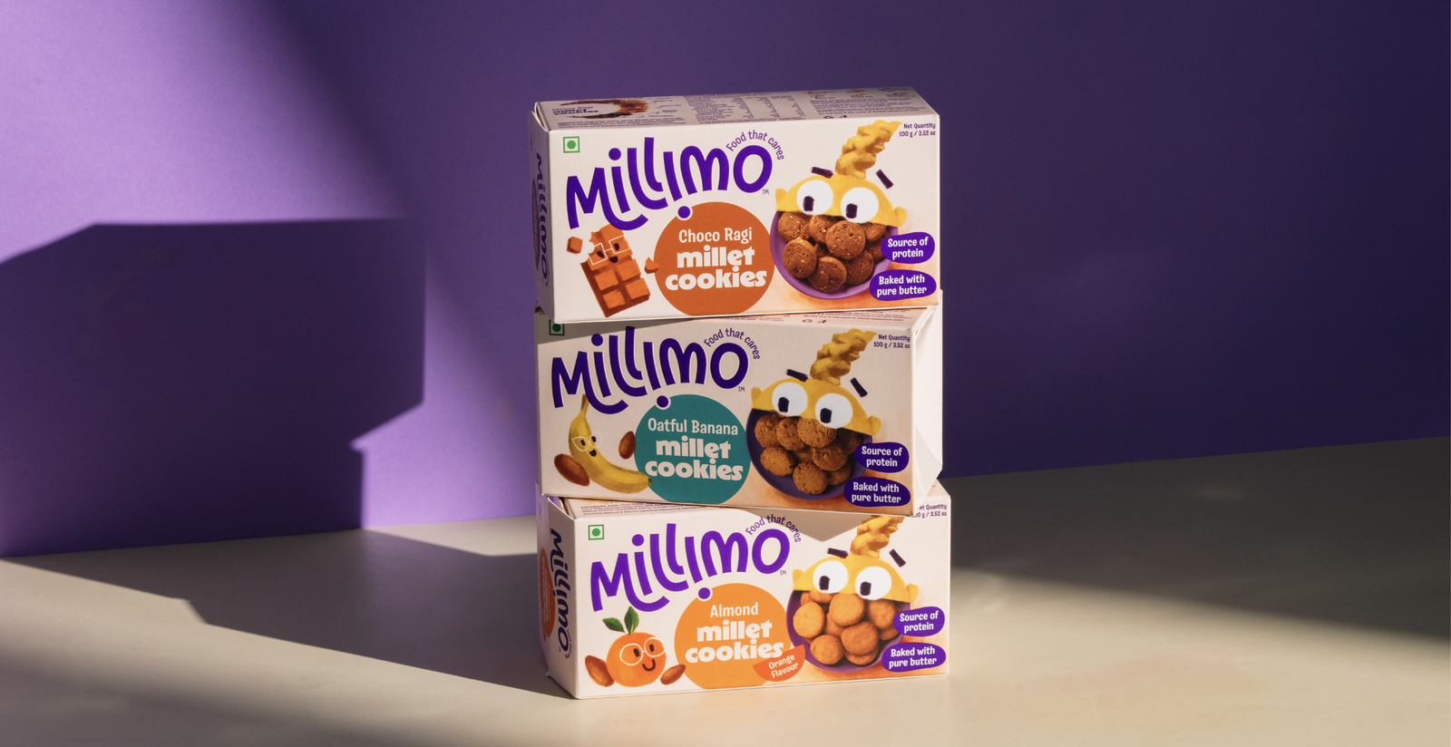
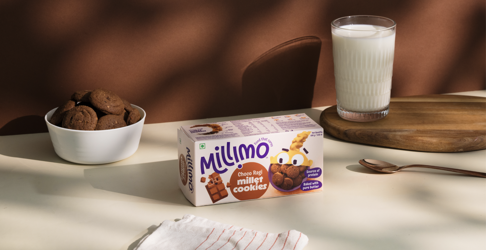
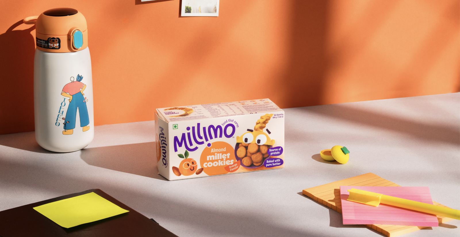
Packaging System
The packaging system was designed to:
– Highlight ingredients clearly
– Create strong shelf recognition
– Maintain a playful tone for children
Bright colours, expressive illustrations and ingredient storytelling ensure the packs feel both trustworthy and joyful.
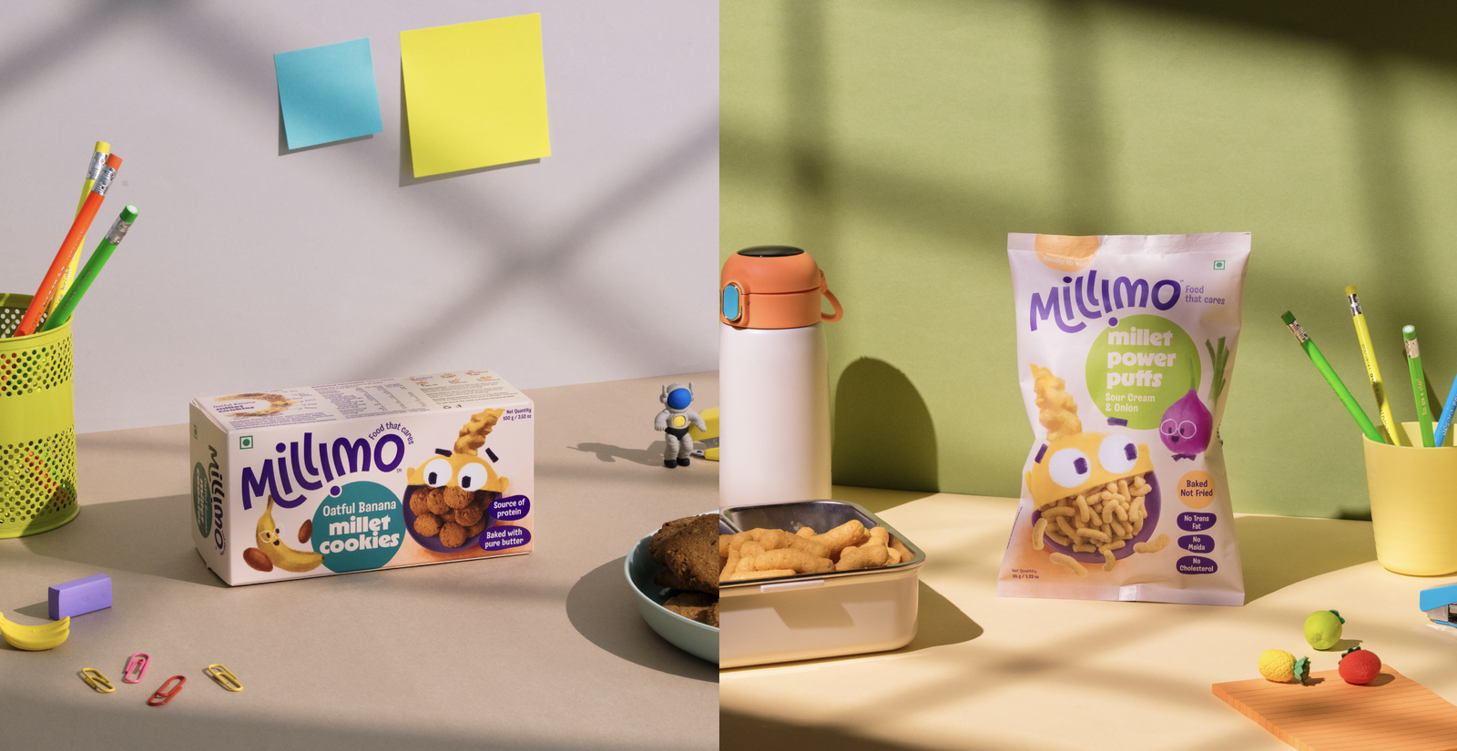
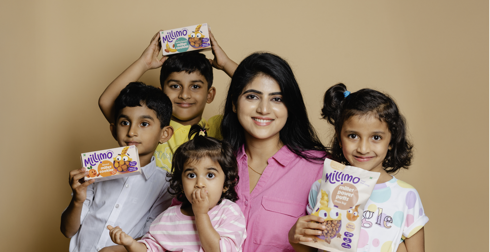

The Brand World
Millimo was built as a complete brand ecosystem, extending beyond packaging into:
– digital storytelling
– educational content
– social media narratives
– character-driven communication
This allows the brand to consistently communicate its mission:
making healthy food enjoyable for the next generation.

Millimo stands apart in the children’s nutrition space by combining: clean ingredient credibility playful visual storytelling a scalable brand system The result is a brand that parents trust and children love.