Leor - Advanced Aesthetics Clinic
The aesthetics industry is crowded.
Every brand promises the same thing – better skin, visible results, advanced technology. From legacy players to new-age clinics, the narrative is heavily skewed towards science, transformation and outcomes. But through our research, a more nuanced truth emerged.
The Insight
Customers don’t just seek better skin.
They seek confidence, comfort and reassurance.
– They want to feel safe, understood and cared for
– They value clear, honest conversations over hard selling
– They remember how they were treated more than what was done
As seen in our primary research, clients consistently associated Leor with:
Trust. Care. Technology. Comfort. Results.
The functional parity was high.
But the emotional gap was wide.
The Strategic Shift
Instead of competing on science vs science, we repositioned Leor at the intersection of: Aspirational × Emotional × Expert-led
A space where the brand doesn’t just perform- it connects. This led us to define Leor as: An emotion-led aesthetic brand with an intentional, minimal, expert-like presence.
We structured the brand narrative across four pillars:
1. The Offering: Advanced. Innovative. World-class. A clinic that is ahead of the curve.
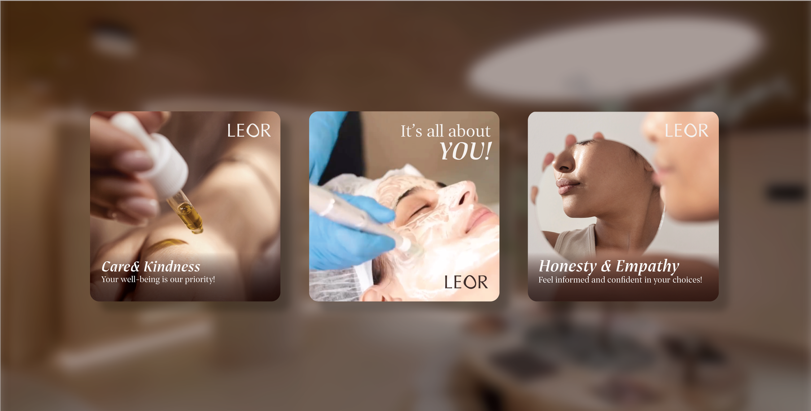
2. The Values: Care. Trust. Compassion. Empathy. Not service – but care that goes beyond.
3. The Emotions: Self-confidence. Self-love. Happiness. A brand that is all about you.
4. The Differentiators: Ethics. Service. Technology. Culture. A truly people-oriented experience.
This framework became the backbone of everything that followed, from communication to design.

The White Space
Mapping the competitive landscape revealed a clear opportunity:
Most brands were either:
– Functional & clinical, or
– Emotional but generic
Leor’s opportunity was to become: A curated, minimal, emotionally intelligent brand rooted in expertise Not loud. Not sales-driven. But refined, intentional and deeply human.
We moved Leor away from clinical sameness to a brand that feels personal, warm and deeply human.
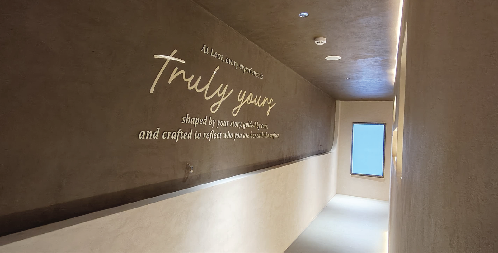
Brand Essence: Truly Yours
A simple promise – that every interaction, treatment and outcome is tailored to you.A brand that feels: Personal, not prescriptive. Thoughtful, not transactional. Tailored, not templated
It shifts the role of the clinic from a service provider to: A partner in your journey.
Design Direction
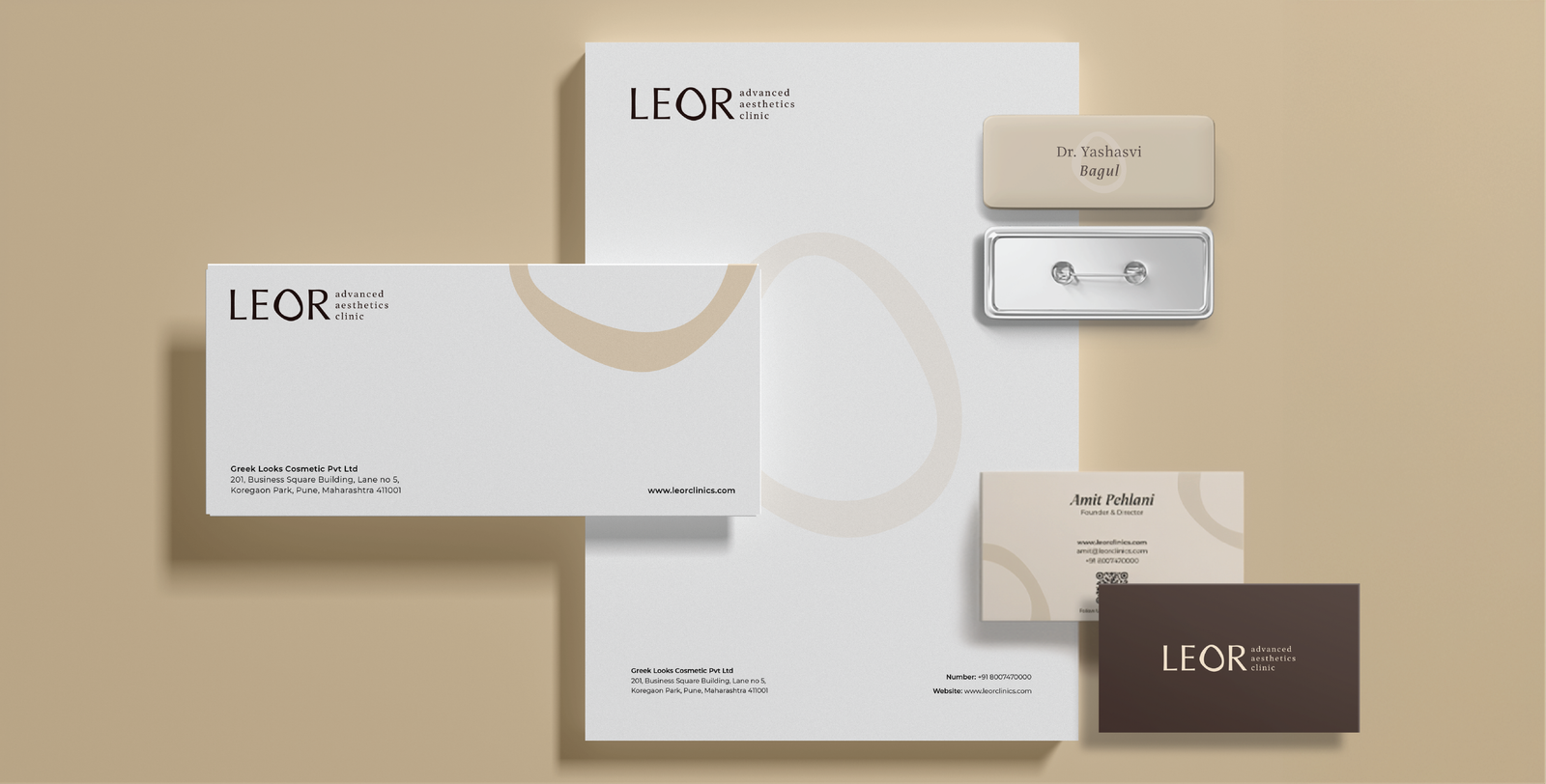
Identity & Visual Language
The identity system was built to express individuality within consistency.
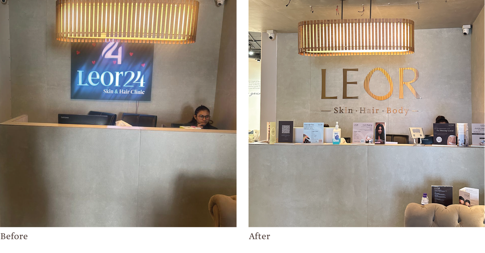
The Logo – A Mark of Difference
A clean, contemporary wordmark disrupted by one intentional anomaly. One letter stands apart – quietly signalling that no two clients are the same.
A subtle cue, but one that embeds the brand’s philosophy into every interaction.
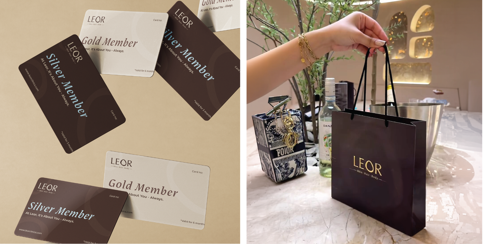
The Colour System: Rooted, Not Trend-led
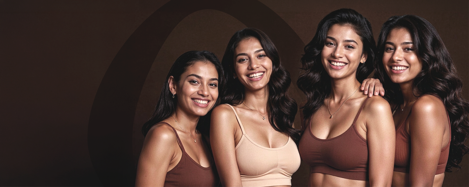
Instead of chasing global aesthetic clichés, the palette draws from authentic Indian tones. Warm, grounded and familiar, making the brand feel personal, not imported.
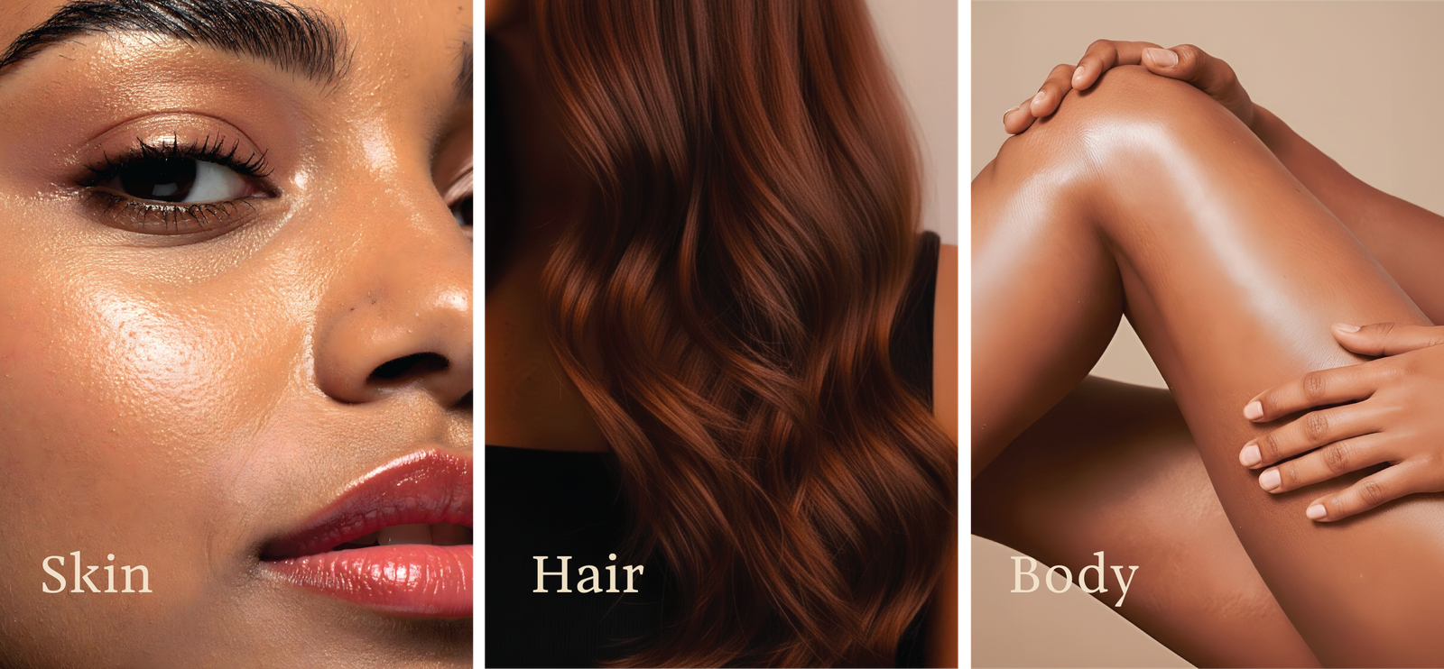
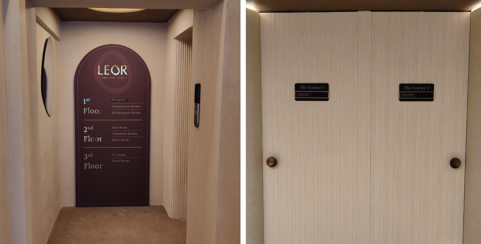
The Motif: The ‘O’ as a System
The visual language is anchored in the form of the ‘O’ – a seamless, continuous shape. It flows across touchpoints – packaging, print, spatial graphics – creating a system that is minimal, recognisable and ownable.
The Overall Expression
Minimal. Muted. Intentional. Luxury that doesn’t try too hard – but feels considered in every detail.
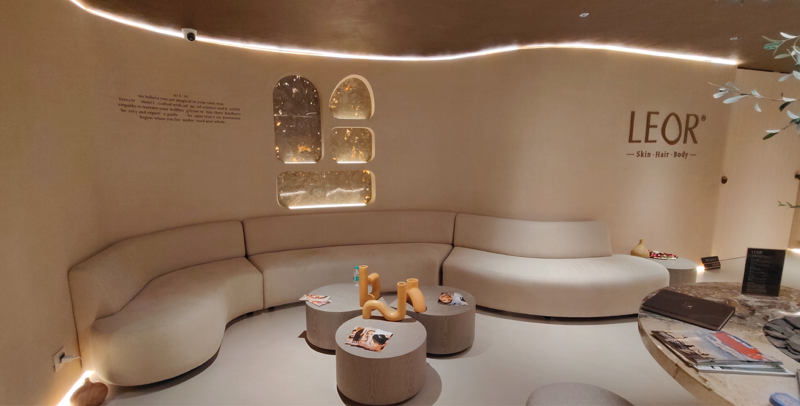
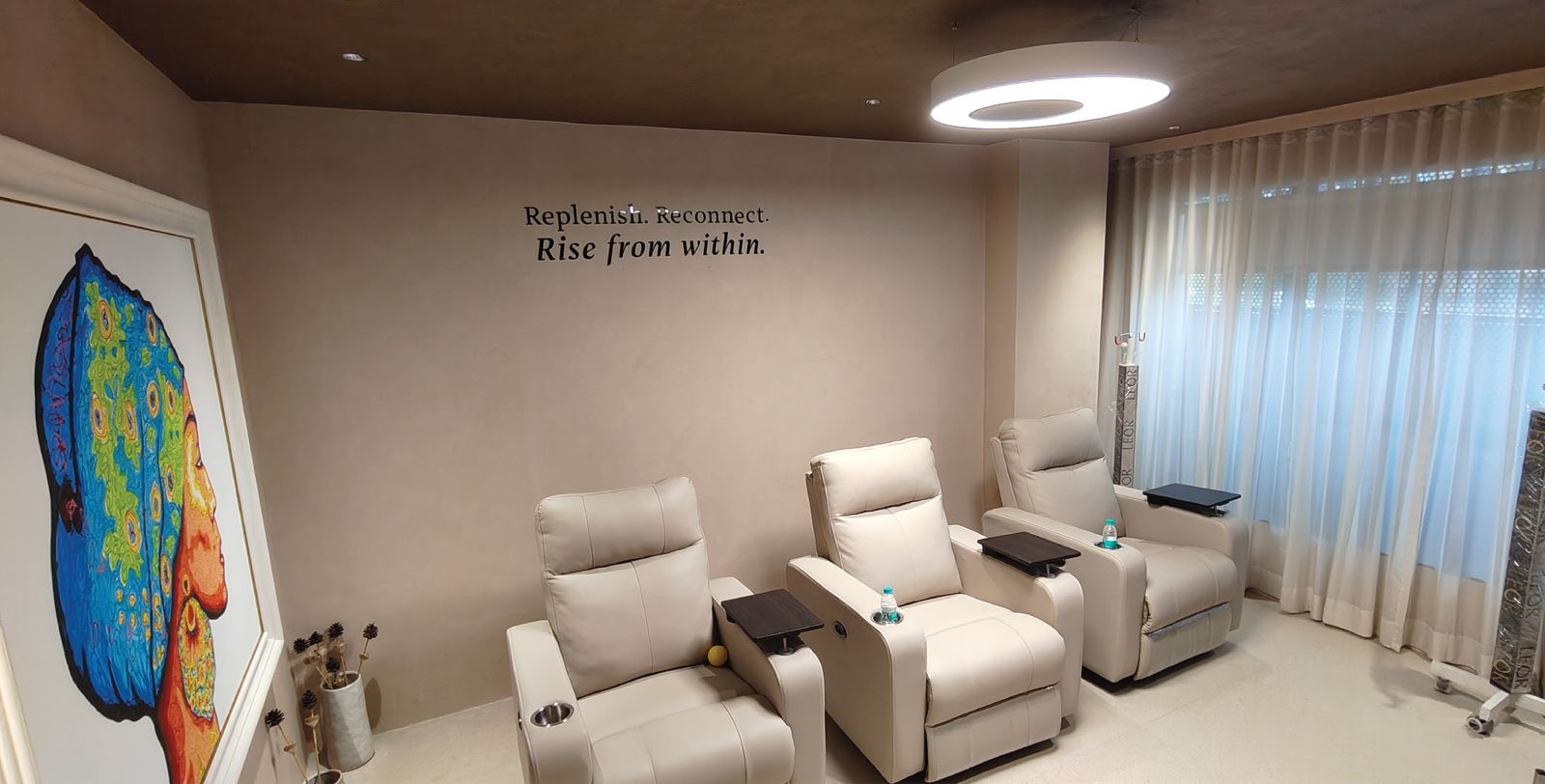
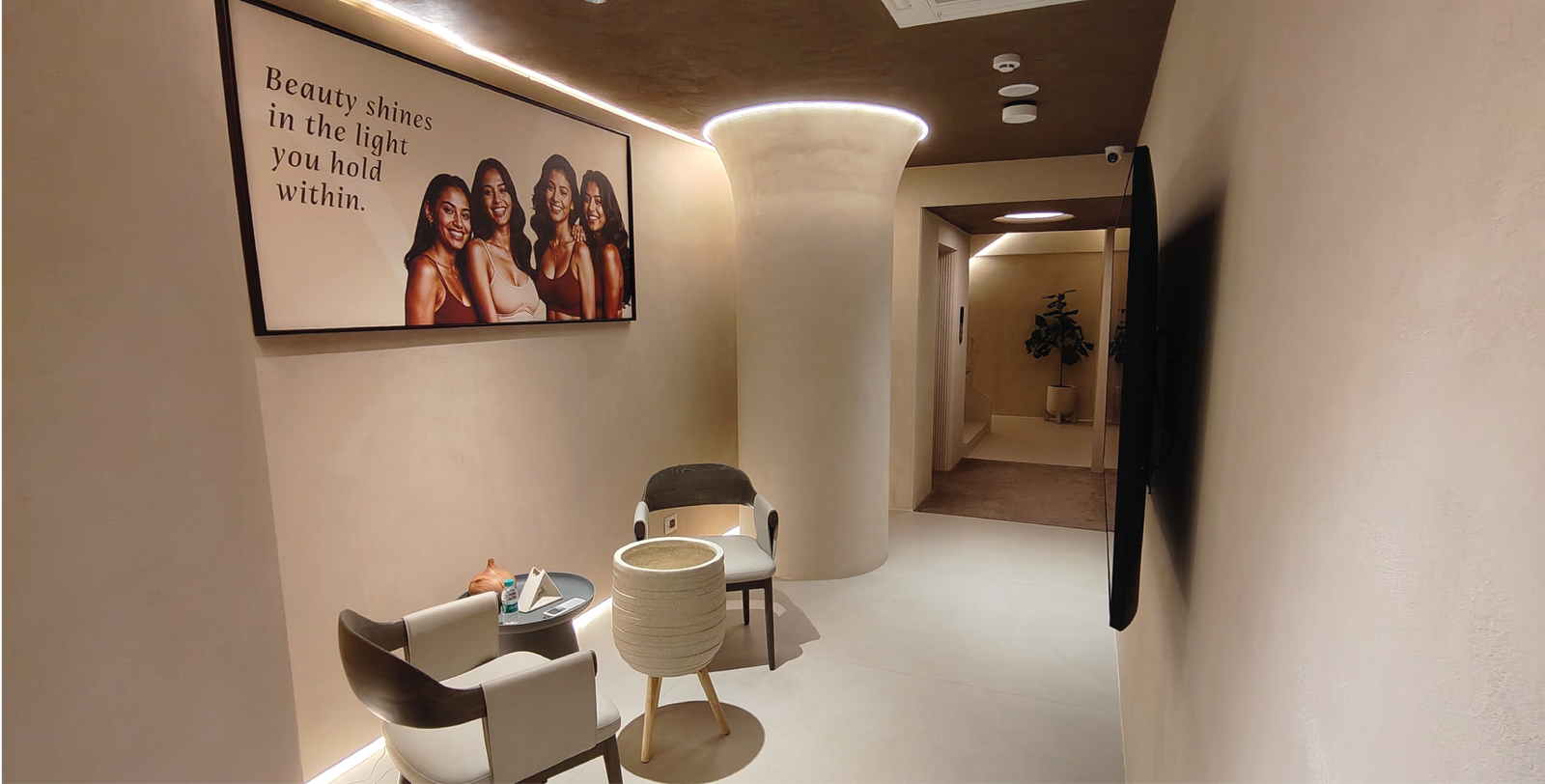
Spatial Storytelling
The clinic is structured as a narrative journey, not just a floor plan. Each zone is intentionally named to evoke an emotional state:
– Kindle — The beginning
– The Essence — Understanding the individual
– Seren — Calm transformation
– Radiance — Visible confidence
– Signature Light — Capturing self-expression
– The Core — Trust and leadership
– Luma Circle — Collaboration and continuity
These aren’t just names—they guide how the client experiences the space. The space does more than house services. It becomes a medium of reassurance, identity and self-expression. A clinic that doesn’t feel transactional, but intentionally personal.
Social Media:
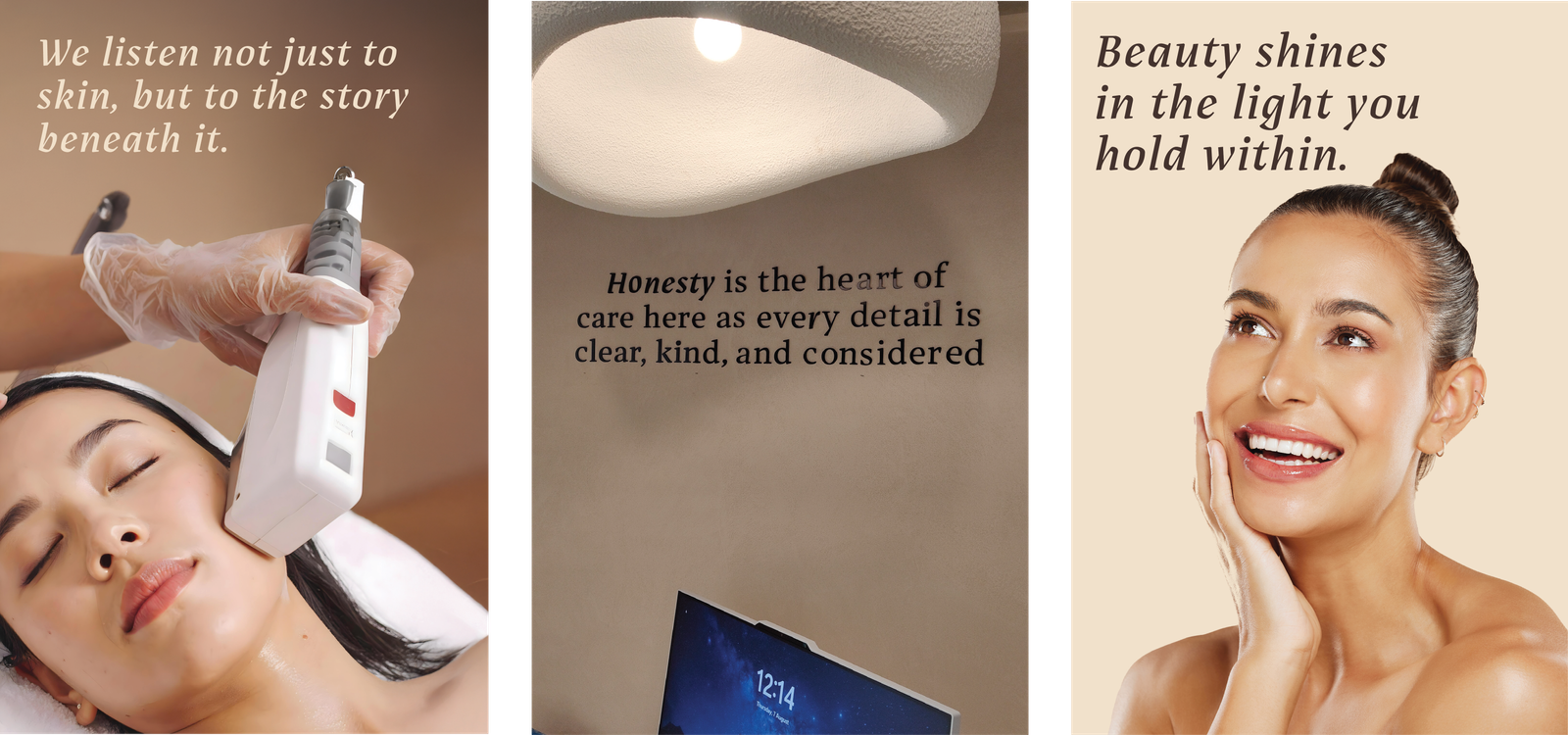
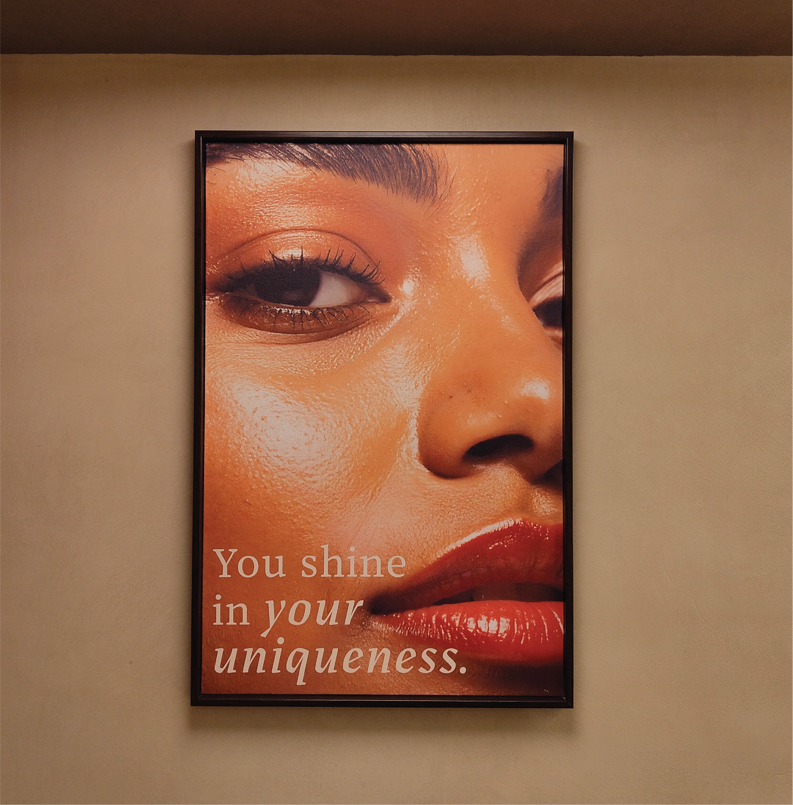
The social media launch for Leor was designed as a quiet, intentional build rather than a loud reintroduction, shifting the platform from a sales channel to a space of connection. Rooted in three emotional pillars: confidence, uniqueness and clarity, the content moved towards real, honest storytelling with warm, authentic visuals that reflected true skin and individual journeys.
By bringing the founders to the forefront, we anchored the transition in trust, allowing the brand’s new essence to feel familiar yet elevated. The result was a digital presence that didn’t just showcase services, but built a community around care, credibility and self-worth.

What i admired the most about Firebrand is, that they are extremely process driven and deeply research oriented.