Boteco Restaurants
Research / Strategy / Branding / Visual Design / Communication / Environmental Graphics
Inspired by the authentic spirit of Brazil.


A land of contrasts, natural beauty and culture – Brazil, is a captivating country with the perfect balance of white-sand beaches, pristine rainforests, colonial towns, dramatic cities and a vibrant way of life. Type inspired by the Art Deco in the Brazilian Modernist movement during the 1920s. Tagline built in a handwritten font to bring about the attention to craft and detail.
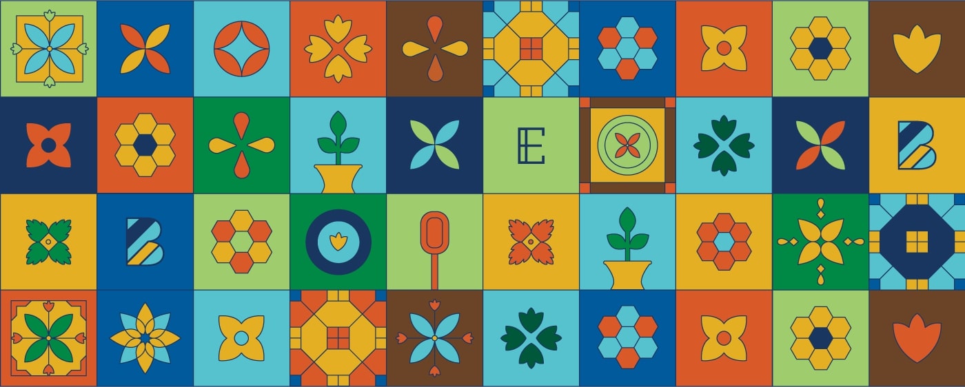
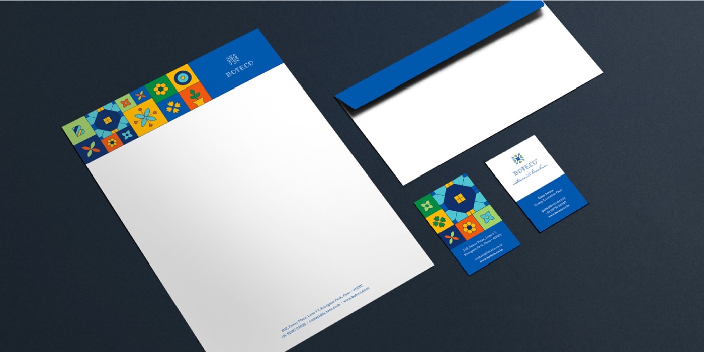
A bold colour palette was built to bring about the vibrancy of the country, without losing the authenticity. Using tile art as a theme a dramatic visual language was created to add vibrancy and dynamism to the brand. The visual language took the mainstage in applications, thus ensuring the identity is not overused. An inspired yet mature colour palette was chosen to bring about the vibrancy of the country, without losing the authenticity.
The identity came together to form a unique and repeatable pattern by using the mnemonic in a way that retains the essence of the identity, and plays with darker and brighter colours for a visually playful effect.

The colour palette is inspired by the natural flora and fauna, and the vibrancy of Brazil as a culture – from the colourful beaches to the Carnival. The primary palette is made up Guto’s deep blue and sunshine yellow, while the secondary palette comprises fresh, energetic and positive colours.


