

Aguante Active
Aguante, an Athleisure brand born from the insights and experiences of passionate runners, fills crucial gaps observed in the market.
By sourcing top-tier fabrics worldwide, Aguante prioritises functionality in every product, catering directly to athletes’ needs. Unlike other brands, Aguante stands out by maintaining a clear focus on a specific mindset and category.
Through the use of innovative functionalities such as seamless zippers and concealed pockets,
the brand merges durability with style seamlessly. Accommodating a diverse range of body types
with various fits, Aguante’s aesthetically designed products provide an abundance of options for athletes seeking both performance and fashion.
Retail Study
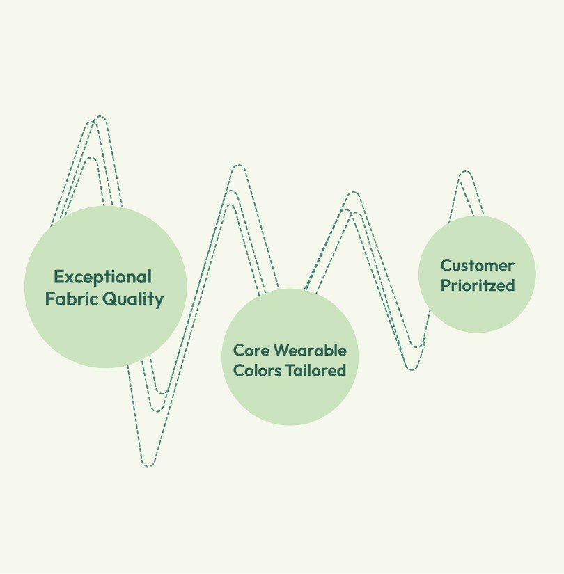
After store observations, customer interactions we found that people were drawn to Aguante for its exceptional fabric quality and luxurious feel, particularly the high-quality polyester & spandex blends. They appreciated the thoughtful selection of core wearable colours tailored to suit the Indian skin tones. Price sensitivity was not a concern, as customers prioritised availability and fabric quality.
However, we noticed the brand had inconsistencies and its generic brand appeal hindered its distinctiveness. Moreover, the visuals failed to adequately showcase the superior quality of Aguante’s products, thus undermining its potential impact.
Consumer Insight
The brand had expanded primarily through its retail presence, without incorporating storytelling or developing communication strategies centred around performance. Seeking a transformation, the brand aimed to pivot from a generic and mass-market orientation to a more focused and niche approach. This involved shifting perceptions from Body Basic (Innerwear) to Aguante (Activewear)

To gain comprehensive insights into consumer perceptions, we divided our audience into two distinct groups: those who made purchases directly from the stores and those who encountered Aguante at runners’ events or meetups. Through in-depth interviews with various personas from both segments, we unearthed invaluable insights that reshaped our understanding of Aguante’s journey ahead.
Interestingly, consumers who made direct purchases from our store exhibited minimal brand recall, associating Aguante primarily with Body Basics Innerwear. This made us see the imperative for a robust in-store branding strategy to enhance brand recognition and loyalty.
Conversely, members of the vibrant runner community lauded Aguante’s products for their exceptional functionality, comfort, and fabric quality.



Brand Positioning
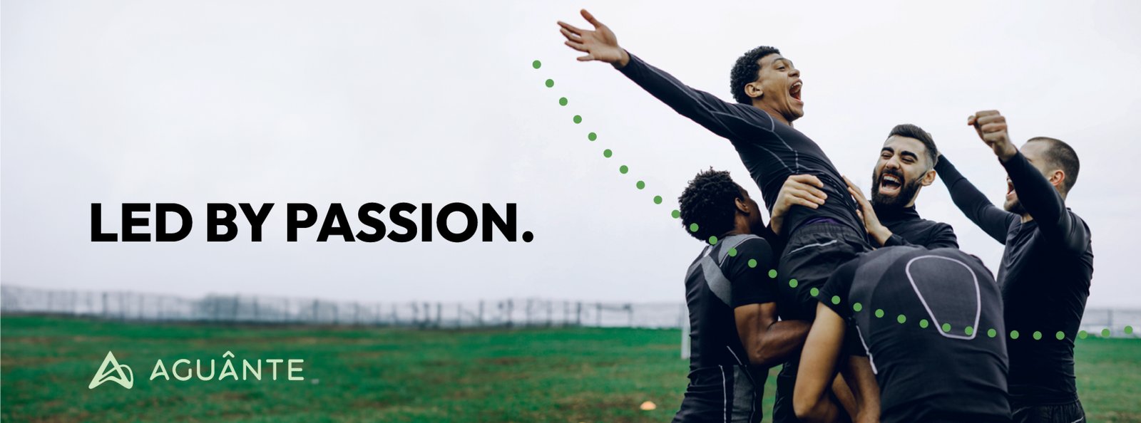
We worked on repositioning the brand from a performance mindset to a passion mindset, and to stand for a narrative that not just understands the community it is serving but also encourages people to take on the sport. We realised that every run is unique; it’s not always about numbers and statistics. It’s a lot about passion, joy, happiness, and community. This insight helped us pivot the brand from ‘Outperform Yourself’ to ‘Led by Passion’.

Passion drives our journey.
Our high-quality activewear is designed to enhance your performance, no matter your chosen pursuit. We believe greatness follows when you let your passion lead.
We’re more than a brand; we’re a spirited community of like-minded individuals.
We’re your companions, your cheerleaders, and your biggest fans.
We are Aguante.

Visual Identity
The brand’s visual identity revolves around the idea that every run, regardless of its scale — whether on a track, or outdoors, on the beach, or in the gym, in India, or abroad — holds significance. Each person charts their own distinct path, and Aguante serves as the unifying force that connects them all.


Color
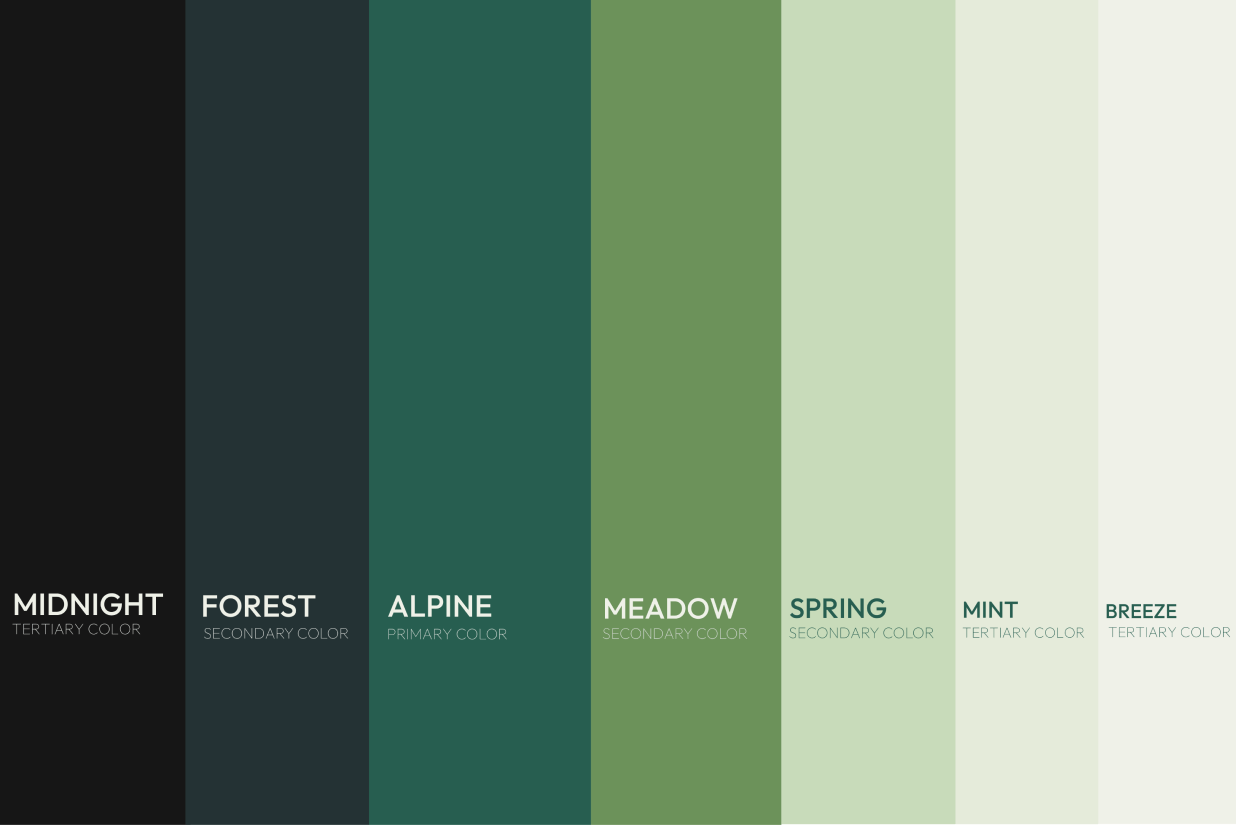
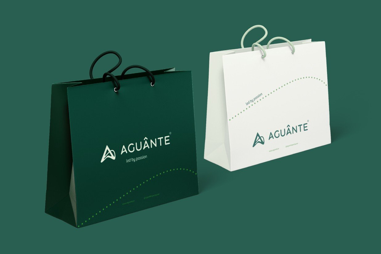
Amidst a landscape saturated with performance-centric hues, we opted for strikingly unique shades of green. This choice not only evokes the essence of the outdoors but also sets us apart from the crowd in the activewear industry. It is mature, evolved and calming.

Packaging
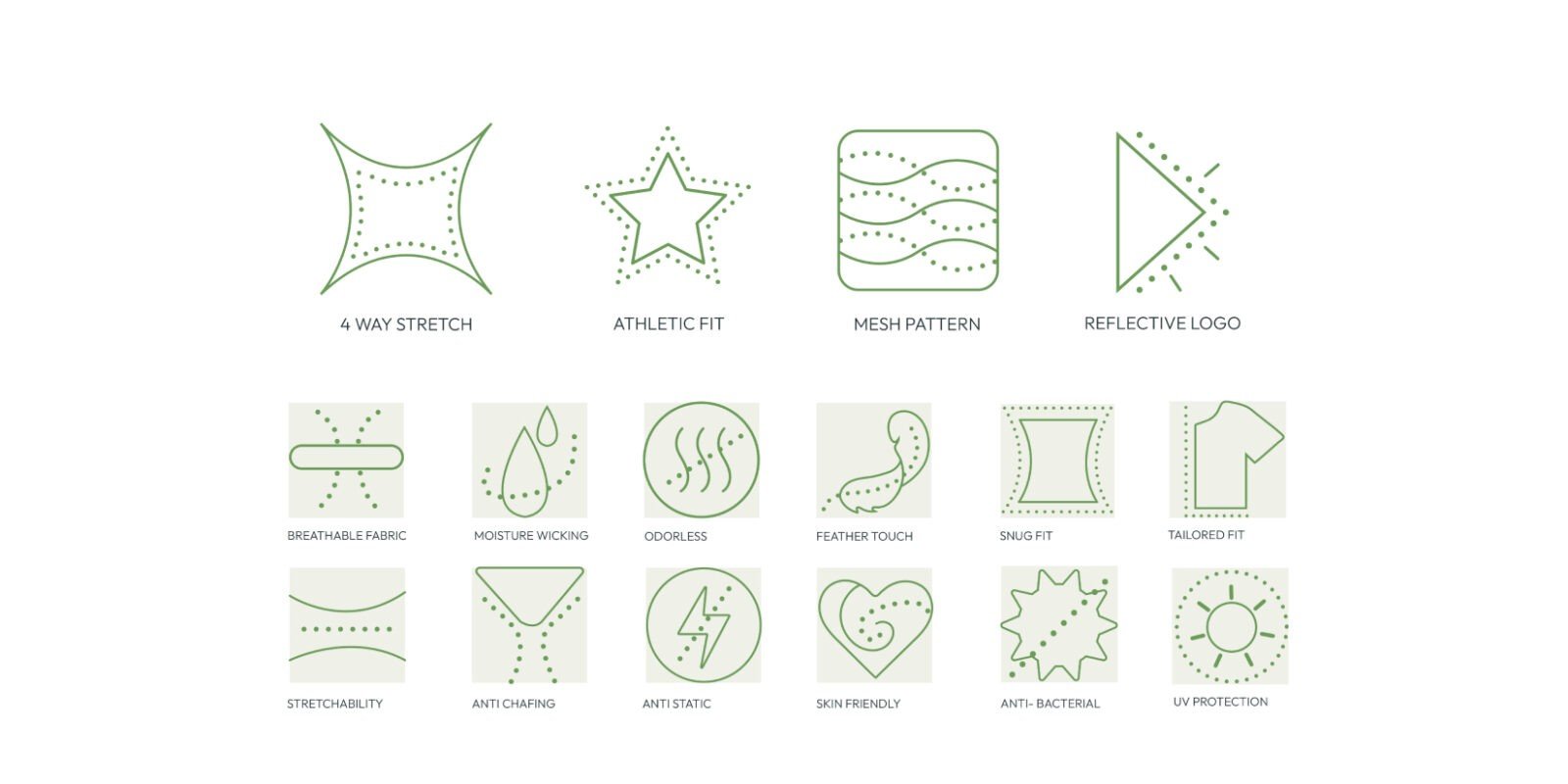
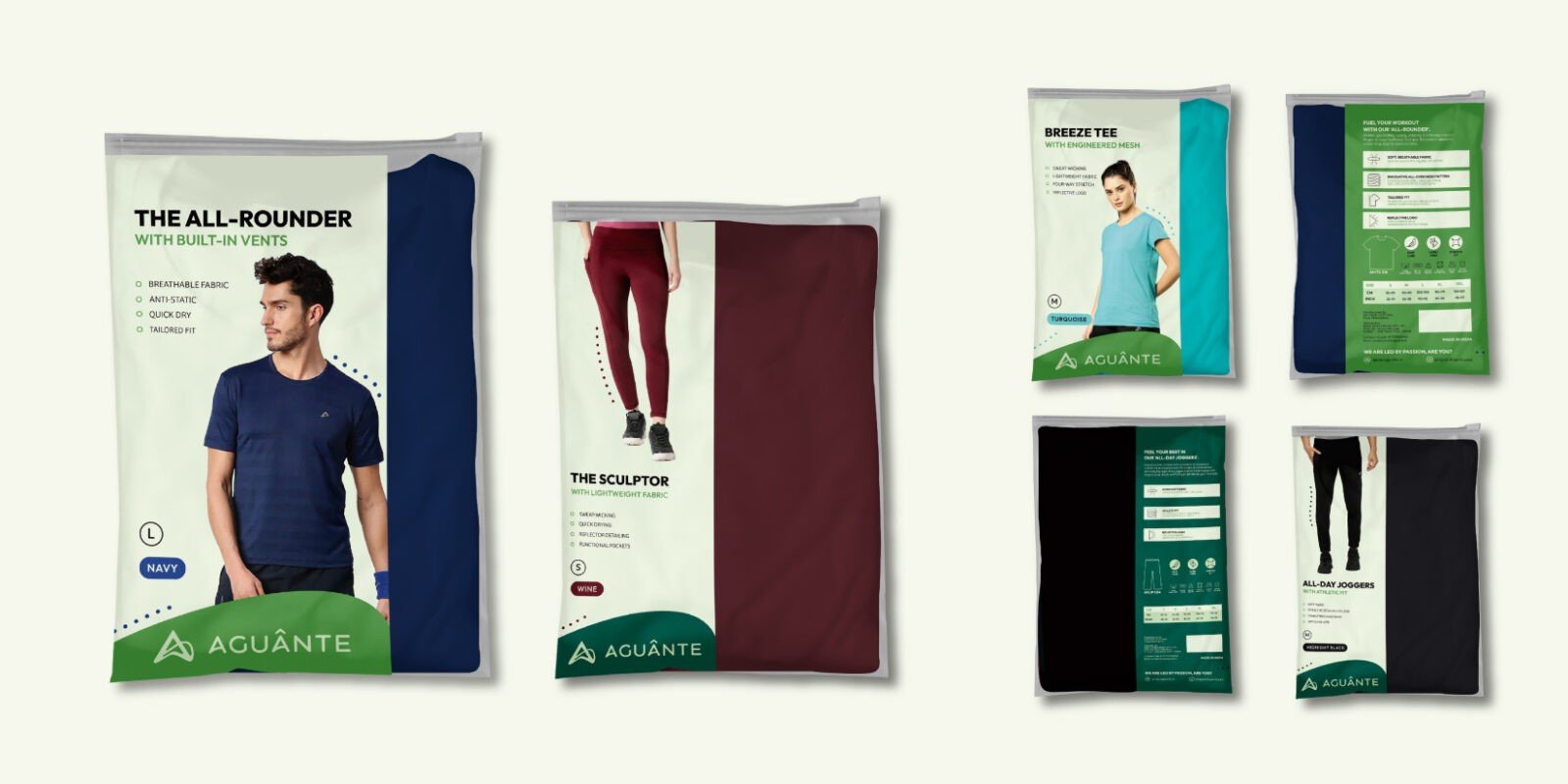
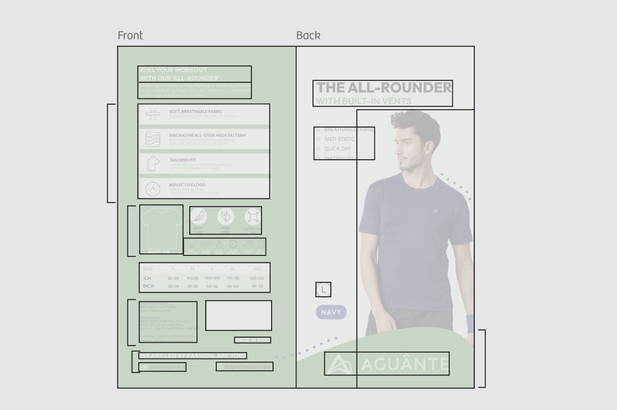
We aimed for every packaging touchpoint, whether labels or sleeves, to delve deeper into the product’s narrative. Packaging emerged as a pivotal touchpoint, serving to convey the brand’s renewed perspective and immerse consumers in a more personal interaction with both the brand and its products. We ensured it cultivates desire and instils trust in shoppers, standing out prominently in crowded multi-brand retail spaces, ensuring maximum visibility, and seamlessly adapting across our ever-expanding range.
We developed an architecture for easy product identification and infused more personality through the brand’s voice, giving each product its own unique character. Custom, easy-to-understand icons were created to effectively communicate product benefits without overwhelming the consumer.
Visual Language
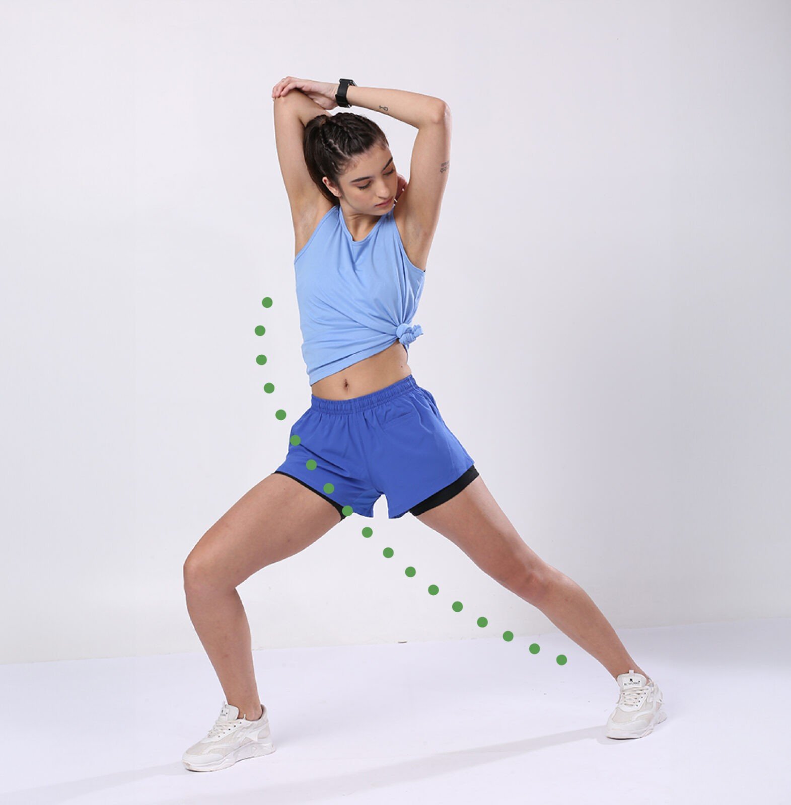
The visual language was crafted around the concept of paths and movements, emphasising the significance of each individual step and its contribution to the overall journey or activity. Together, these seemingly small movements culminate to form the complete run or task at hand.
Thank you Team Firebrand for this whole process and we are happy with the outcome. It was great working with you, lots of new learning for us. Thank you again, Ankita and team Firebrand.
Manoj Thakur
Co-Founder and CEO
Body Basics Retail Private Limited


