
Guto’s
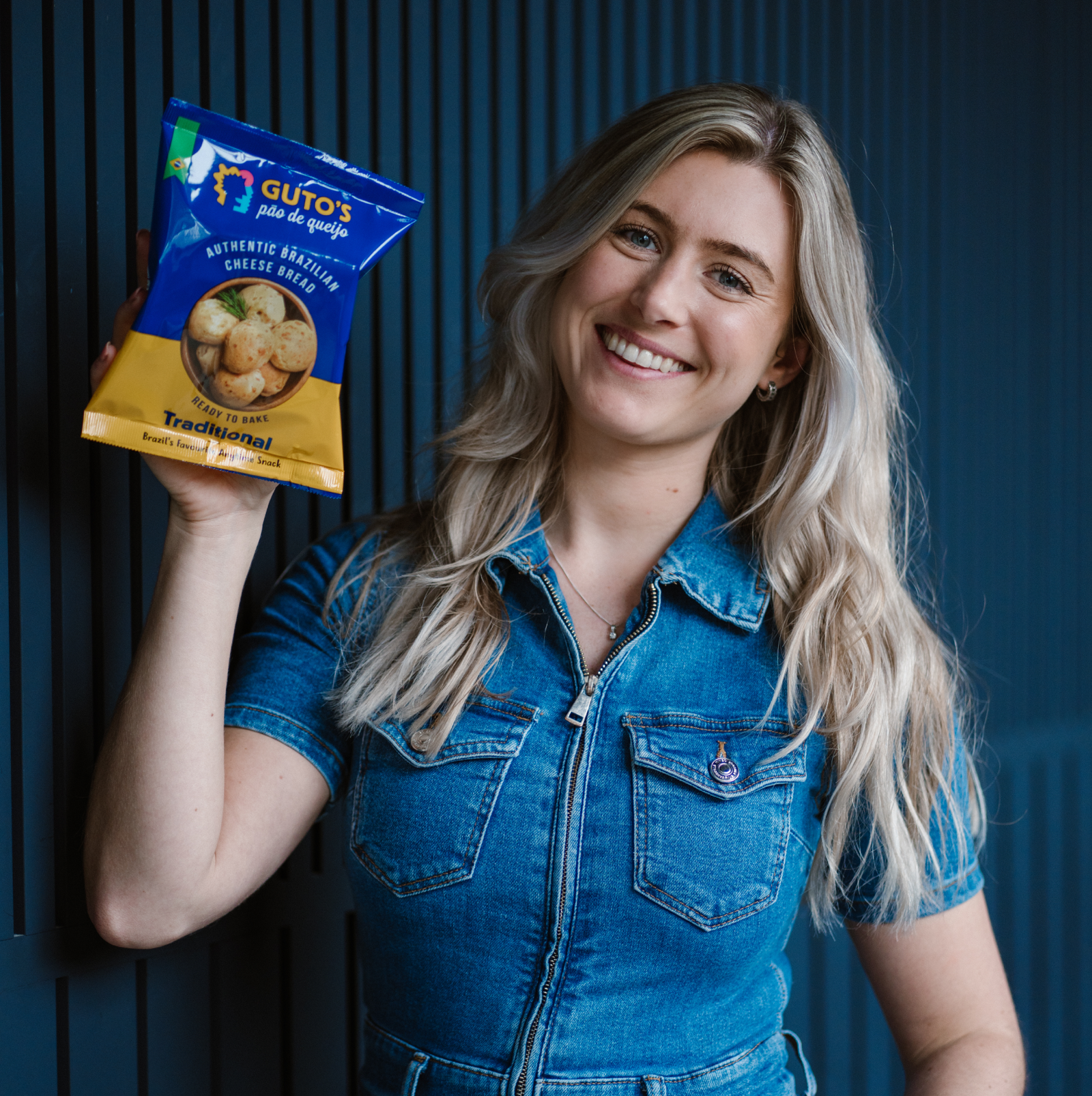
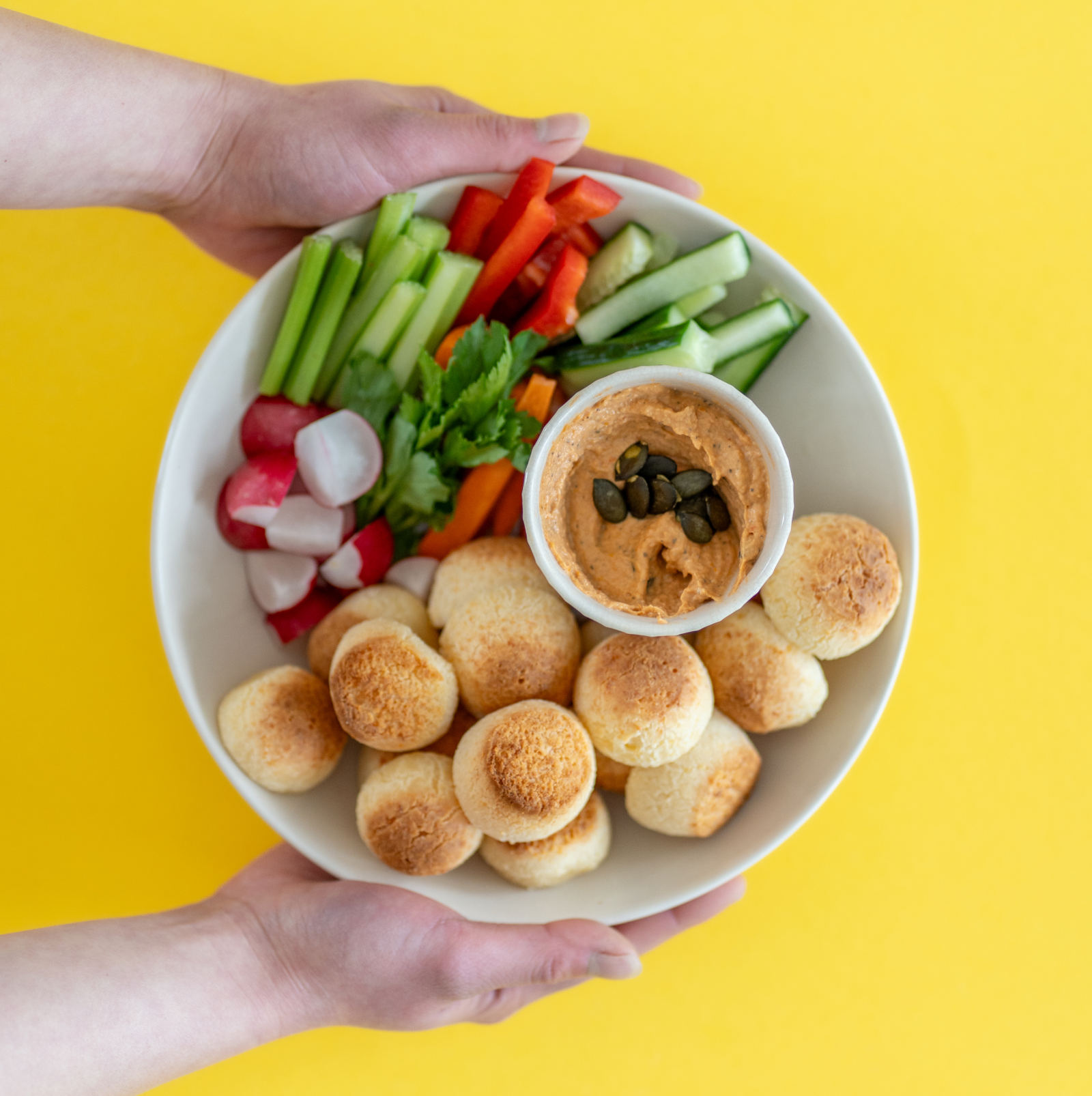
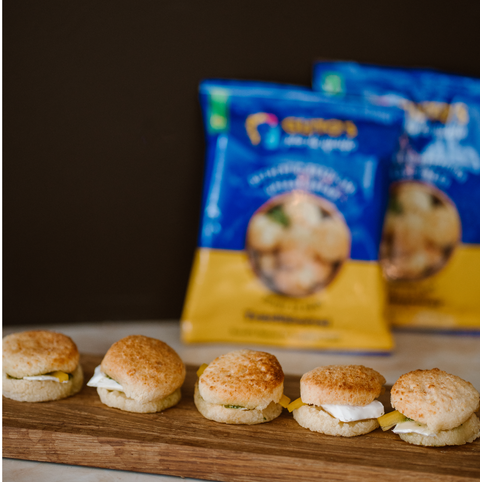
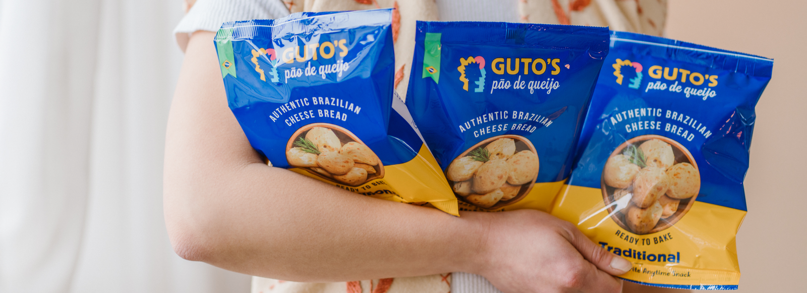
Boteco Restaurant decided to launch a new retail brand in Amsterdam with their popular product – Pão de Queijo (Brazilian cheese bread) in the frozen food segment. Pão de Queijo is a staple in Brazil, however is relatively unknown in Europe. The challenge lay in not just introducing the product category but also tying its origin back to Brazil. The goal for this start-up was about making a distinct brand that was international yet Brazilian in its roots.
Chef Guto’s (partner at Boteco Restaurants) name was leveraged for the brand as it brought with it a uniqueness that the company could own distinctly. Guto’s origins go back to Minas Gerais, Brazil which also happens to be the place Pao de Queijo originated from, hence adding a strong sense of authenticity to our product story.
We positioned this brand as a culturally inspired brand that captures the personality & story of Chef Guto Souza, in an abstract and less-obvious manner through a strong narrative using Brazil as the backdrop.

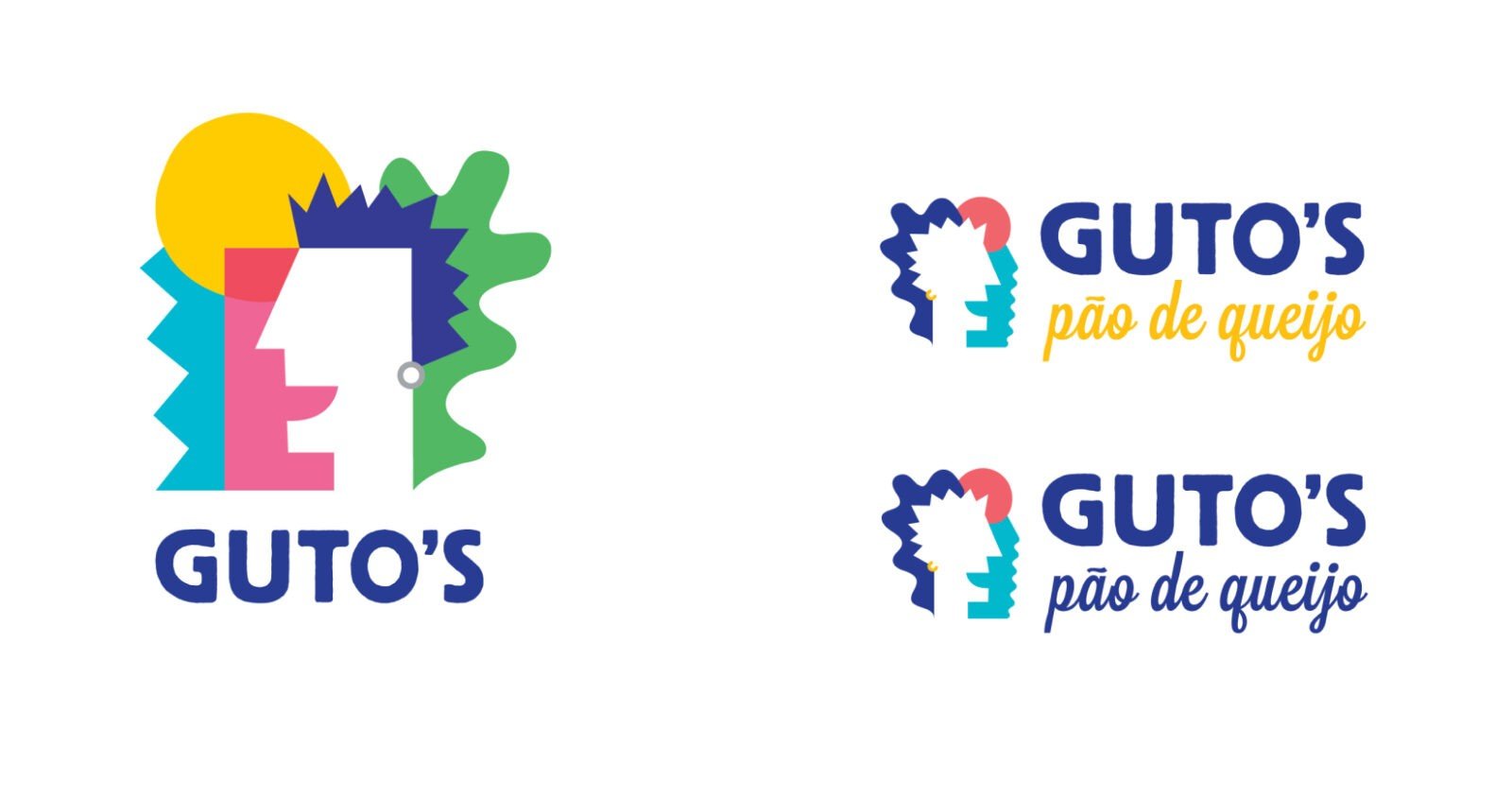


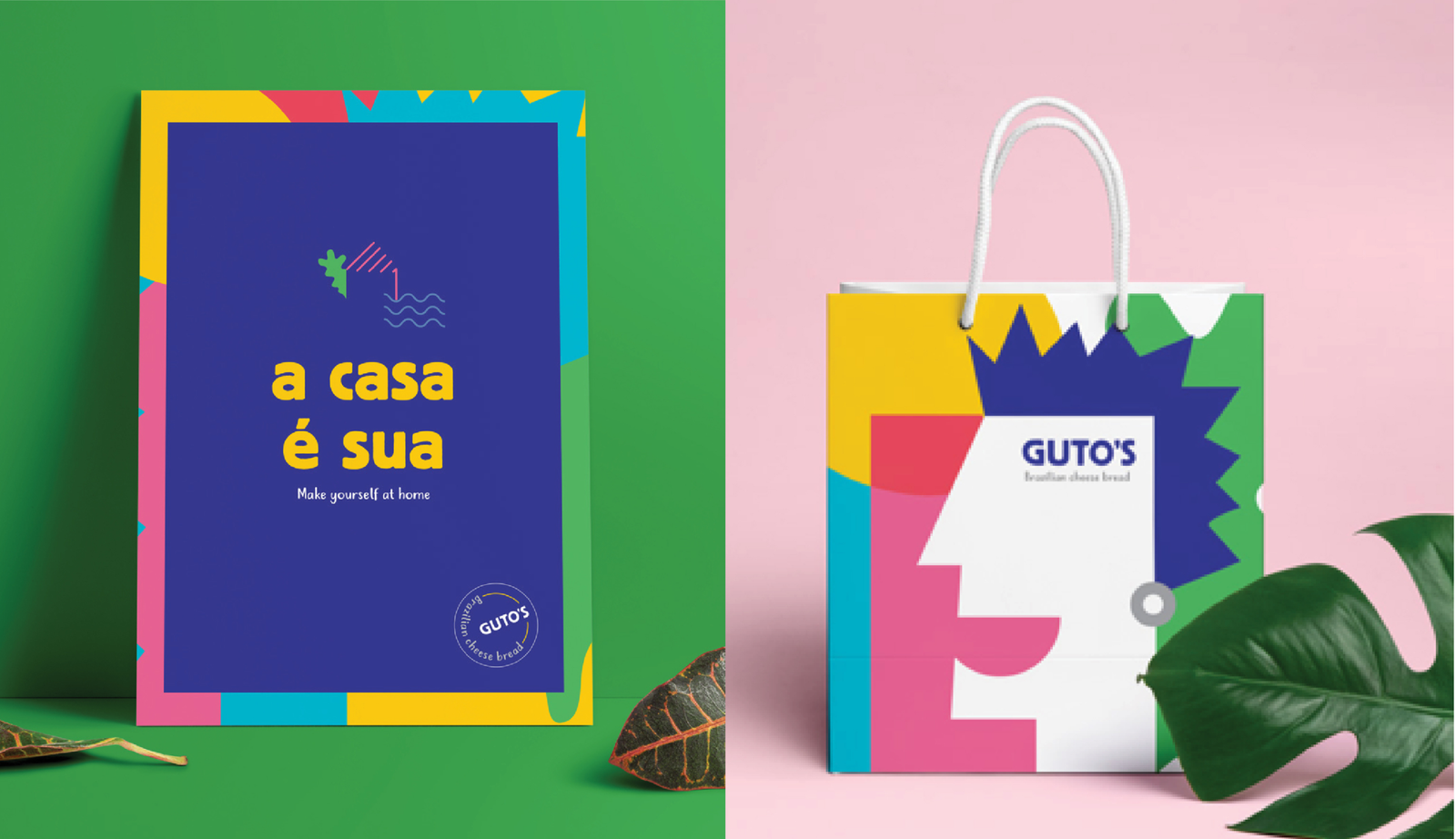
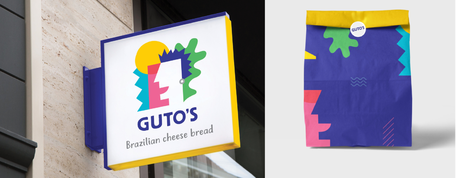
The colour palette is inspired by the natural flora and fauna, and the vibrancy of Brazil as a culture – from the colourful beaches to the Carnival. The primary palette is made up Guto’s deep blue and sunshine yellow, while the secondary palette comprises fresh, energetic and positive colours.
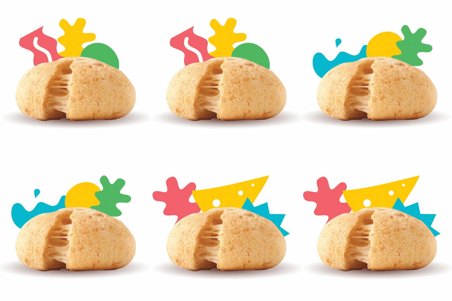
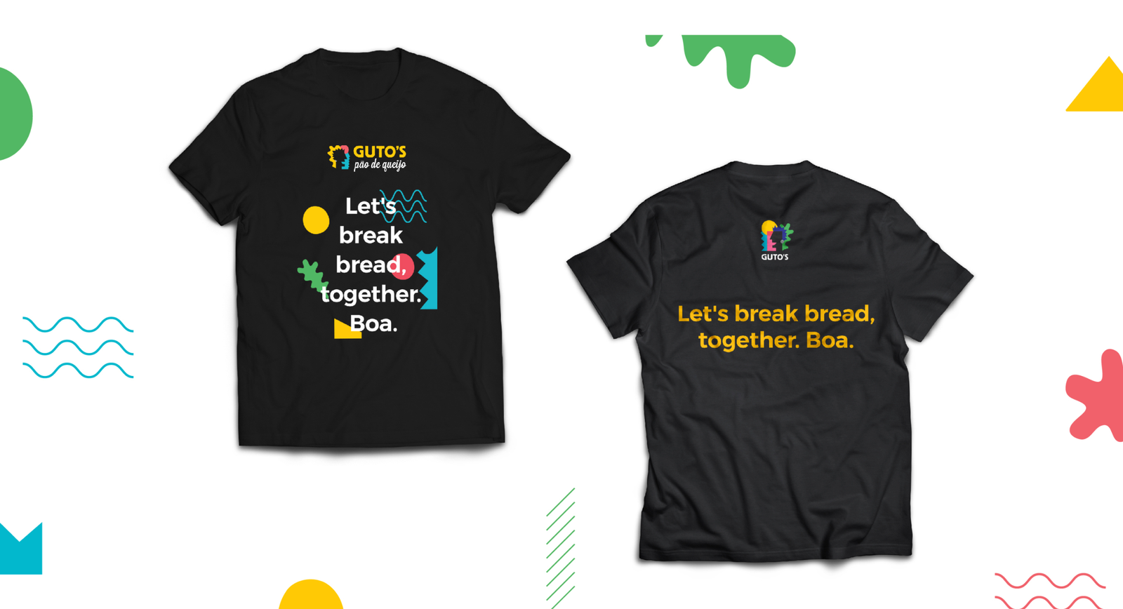
The visual language of the brand comes together as compositions using the key graphical elements of the logo to create dynamic and flexible visuals. The goal was to create interesting graphics layered with a play of colours to portray the energy of Brazil & the personality behind the brand.
