Sproos Sauces
Sproos is a D2C clean nut-sauce brand that is not only nutritious but also versatile.
The founders of Sproos approached us with a determination to change the way labeled food was perceived and to build a thoughtful pantry for all. The goal of the brand is to encourage urban Indians to take charge of their nutrition by cooking for themselves.
So, what happens when two friends, both food technologists, driven to champion clean labels, come up with a product that is so dynamic, tasty, and unique? It enables everyone to experiment with cooking.
We conducted one-on-one interviews with a varied group of urban Indians to understand their emotions and associations with home cooking. Primary research led us to the discovery that for consumers, knowing the base or flavour enables quick purchases. We conducted supermarket shelf audits and mystery shopping, concluding that the nut-sauce category is fairly untapped, with the market dominated by peanut butters.
But most importantly, we found that when people cook for themselves or their loved ones, there is a sense of accomplishment they feel. For a brief moment, they all become chefs.
This insight led us to the realisation that sometimes just a little bit of sauce, dressing, or dip is enough to make everyday cooking fun.

We came up with the name – Sproos, derived from ‘Spruce Up,’ indicating that consumers can elevate any dish with this brand. Sproos could be your one true companion to inspire the chef in you. We arrived at a purpose for the brand – to enable a chef in everyone to create food that’s art.
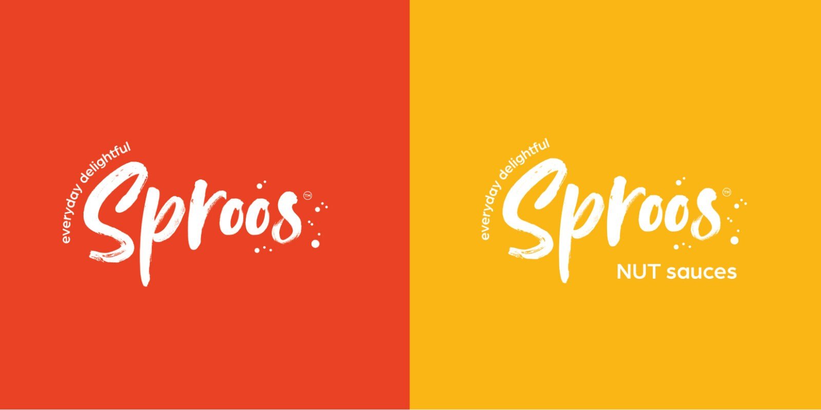
The identity was inspired by an art stroke, aiming to inspire people to create food like a chef—to create art. The art stroke identity finds its character with the use of splashes and drops, based on the idea of making a mess, experimenting, but most importantly, having fun with Sproos.

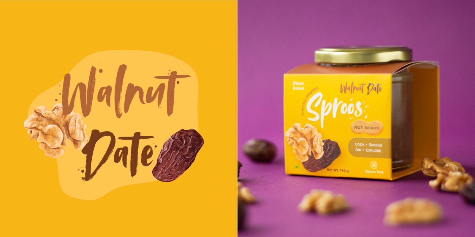
We illustrated each ingredient with equal importance, irrespective of its size, and ensured that the unique combinations not only sound interesting but also look like they belong together.
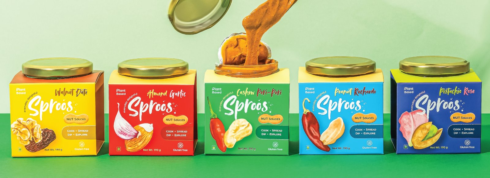
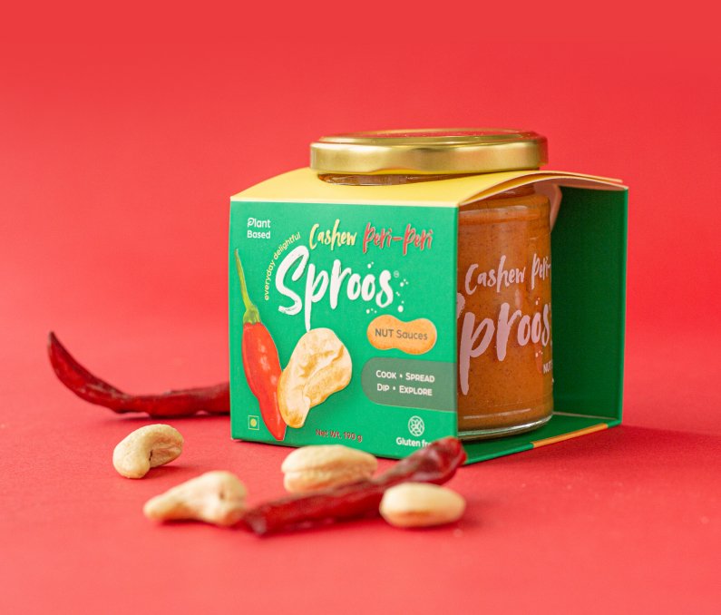
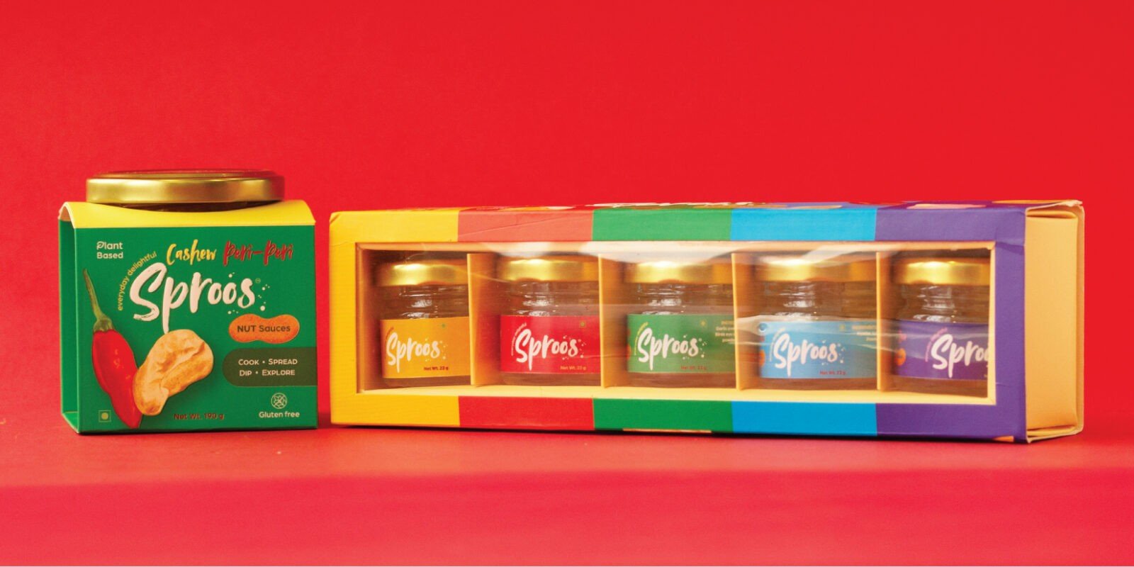
Our packaging canvas was unique—a semi-box-like structure that not only showcased the product but also provided us with enough space to tell our story.
Our research showed us that the real joy for consumers isn’t just in cooking but also in serving and plating it for a loved one. With Sproos, we aim to make users feel good about the process of cooking and plating with love


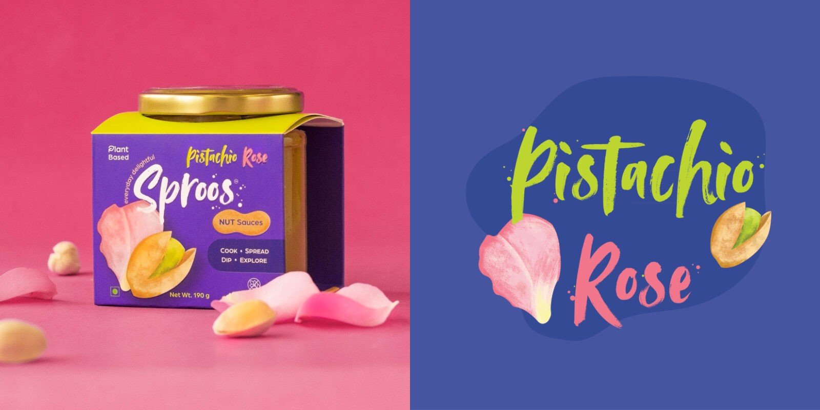
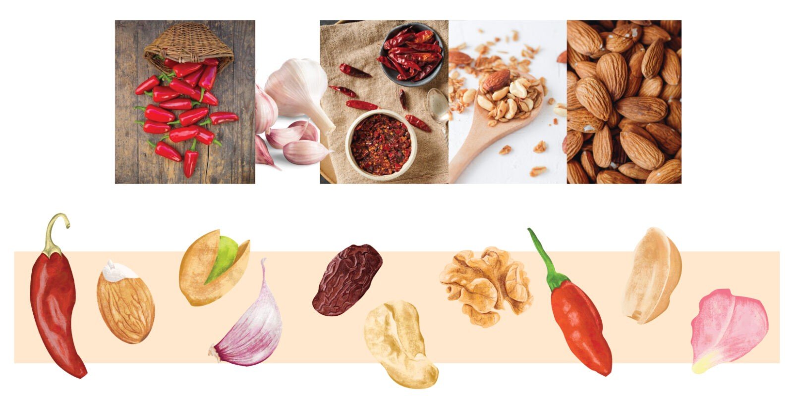
We wanted to keep the ingredients and the interesting combinations as the core focus of this packaging story. We selected vibrant colors complementing the sauce colors and made the illustrations larger than life. We developed prompts that would encourage consumers to see this product as versatile and multi-purpose. With the use of typography, nut shapes, and textures, we built an ownable visual narrative.


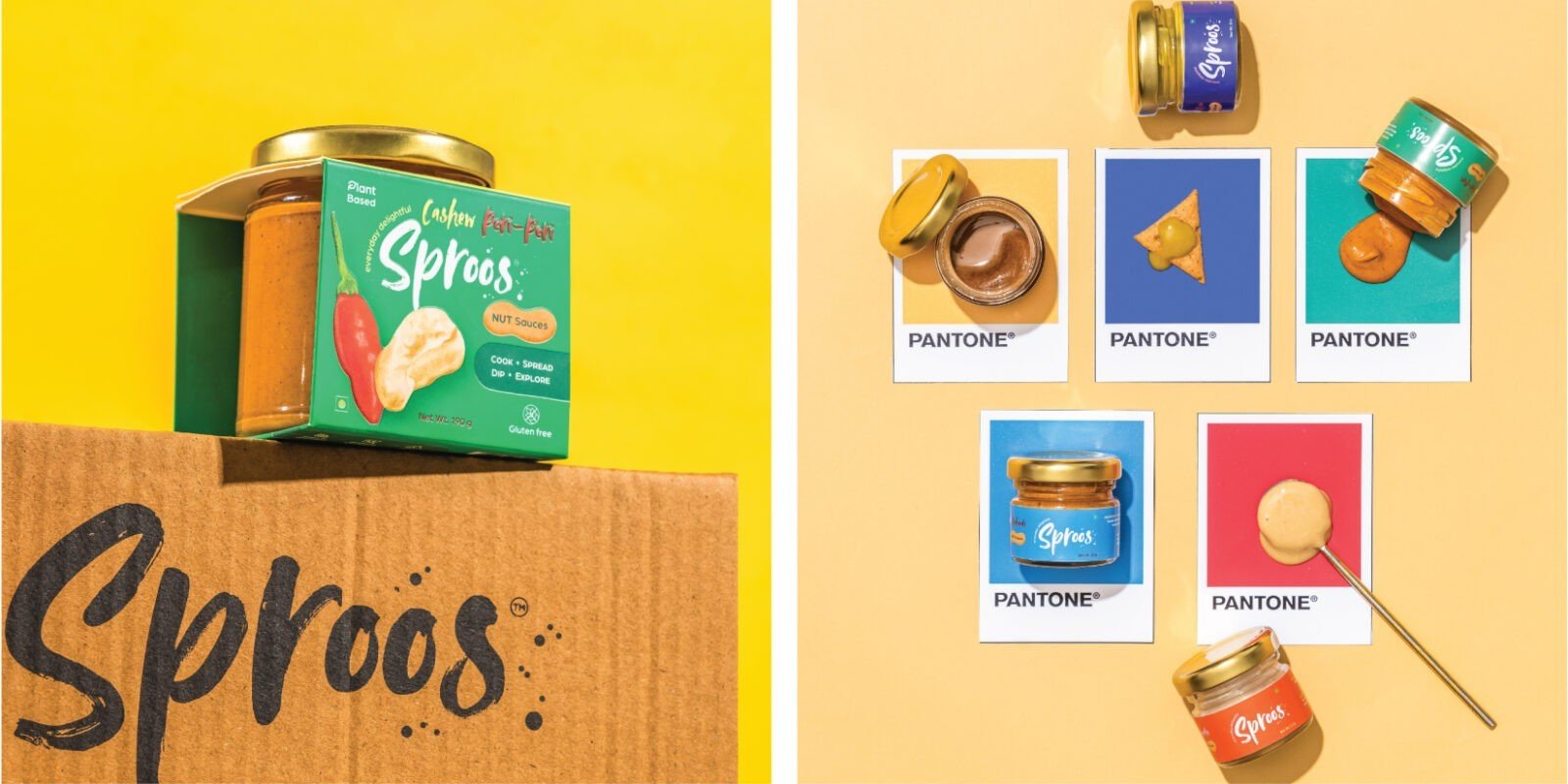
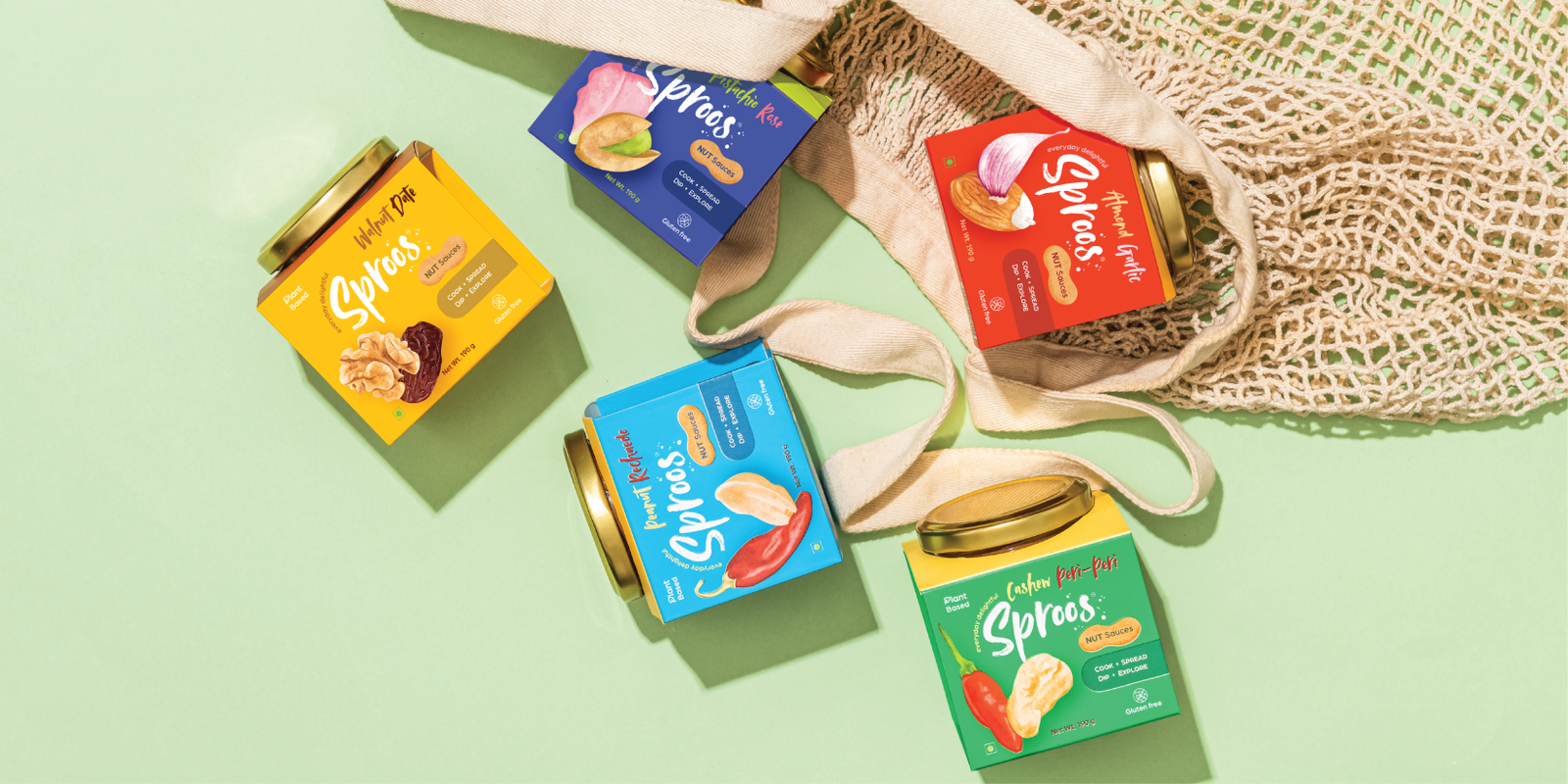


Working with Firebrand India on the creation of our brand, Sproos, has been an absolute blast!
Ankita, Ashima, and the entire Firebrand crew are like a creative dream team. They took our scattered ideas and turned them into a cohesive, eye-catching brand that we couldn't be more proud of. From brainstorming sessions to the final unveiling, every step of the process was smooth sailing. And let's talk about that packaging – it's like they sprinkled some magic dust on it because everyone can't stop raving about it!
Been over an year of collaboration, and we're still pinching ourselves at how lucky we were to stumble upon Ankita and the entire team. Thanks a million for bringing our vision to life in the most fun and fabulous way possible! We love y’all
Vishwa & Shivani


