Unalome - Your Journey Within
Unalome is more than just a mental health service provider—it is a sanctuary for individuals seeking quality psychotherapy. Positioned at the intersection of evidence-based practice and holistic care, Unalome offers more than the traditional “counselling” many have come to expect. Their focus extends beyond symptom management; they embrace the biopsychosocial model, treating each client as a whole—mind, body, and spirit. With a commitment to professional rigour, Unalome’s team consists of seasoned therapists trained in the most effective, scientifically-backed methodologies. Their aim: to make top-tier mental health care accessible to a niche yet growing audience in India.
In a country where quality psychotherapy remains hard to come by, Unalome faced a dual challenge. First, the misconception surrounding psychotherapy vs. counselling meant that the depth and rigour of their services were often misunderstood. While the public tends to associate mental health services with passive listening and generic advice, Unalome offers a far more structured and process-driven approach. Second, after four successful years of operation, the brand realised it needed to evolve its identity to reflect its deeper, more holistic mission. They sought to convey their value as not just providers of therapy but pioneers of comprehensive mental health care, driven by evidence-based practices.
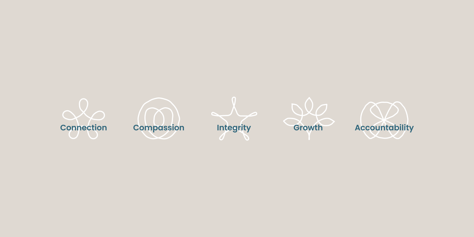
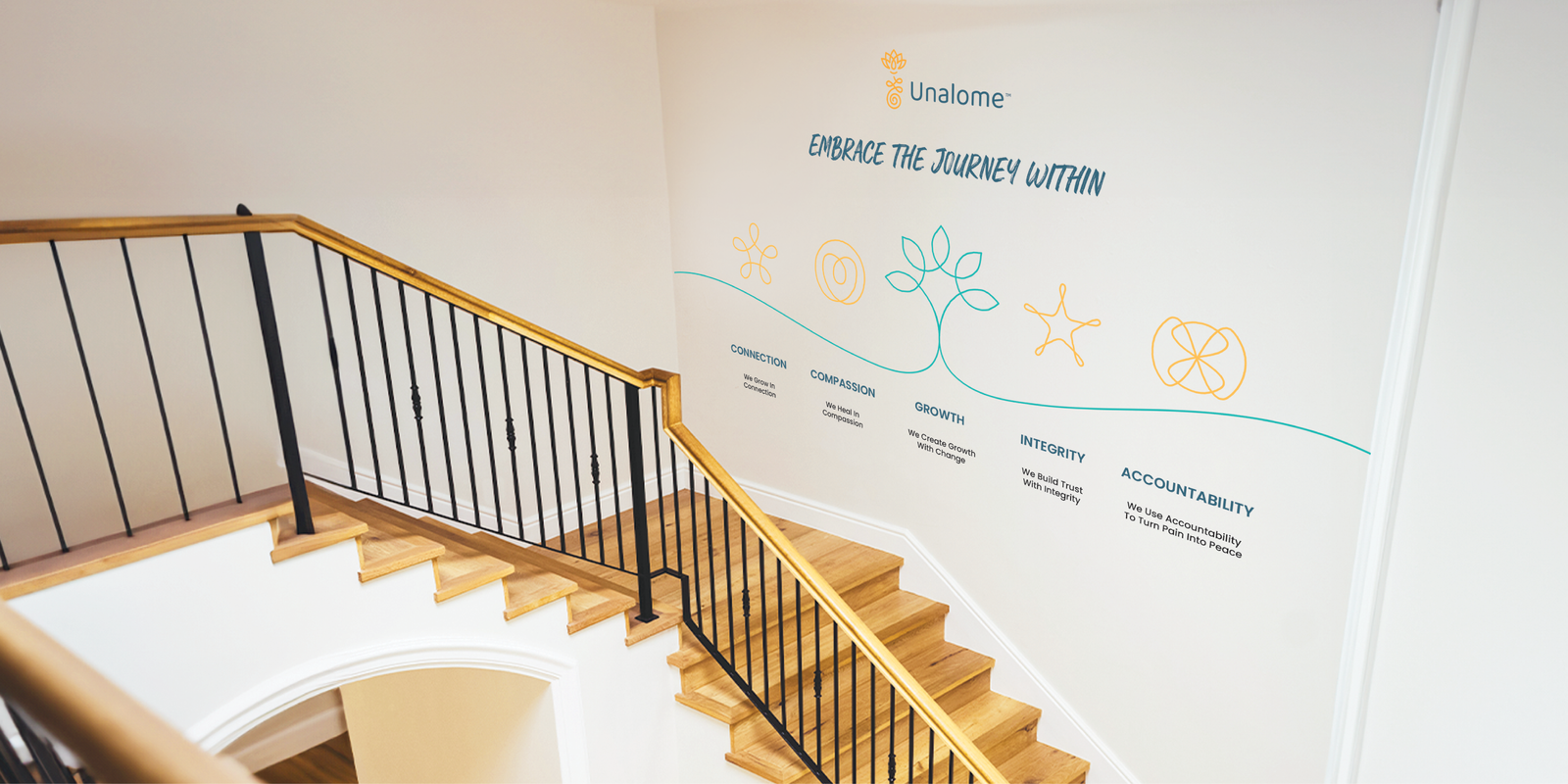
Mental health is still surrounded by stigma, and therapy remains a difficult conversation. We aimed to position Unalome as a symbol of optimism, shifting away from the negative perceptions of mental health. Built on values like Honesty, Integrity, Compassion, and Accountability, Unalome’s process-based approach offers tailored care, empowering clients to take control of their mental health journey.

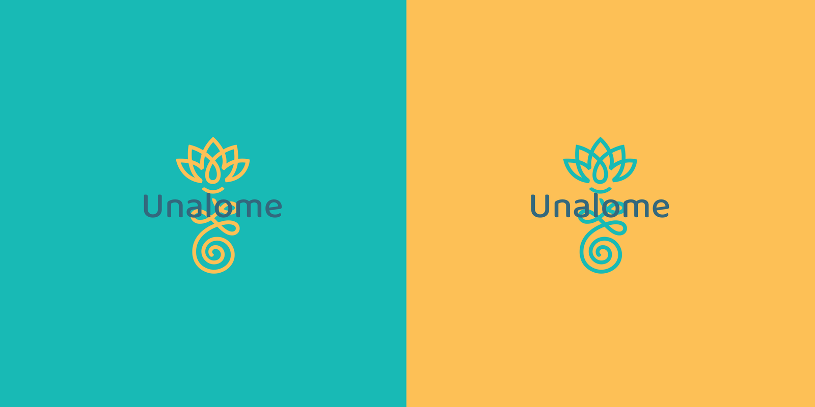
Symbolism and Storytelling
The name “Unalome” draws from Buddhist and Hindu symbols, representing the winding path toward enlightenment. This symbol became the core of the brand’s identity—a reflection of life’s ups and downs, and the continuous work of understanding emotions and aligning thoughts, feelings, and actions.
We reframed the conversation to focus less on problems and more on the journey of healing. Unalome’s strength lies in its process-driven therapy, helping clients navigate their emotions, learn about themselves, and make healthier choices. The message became one of growth, empowerment, and self-discovery.
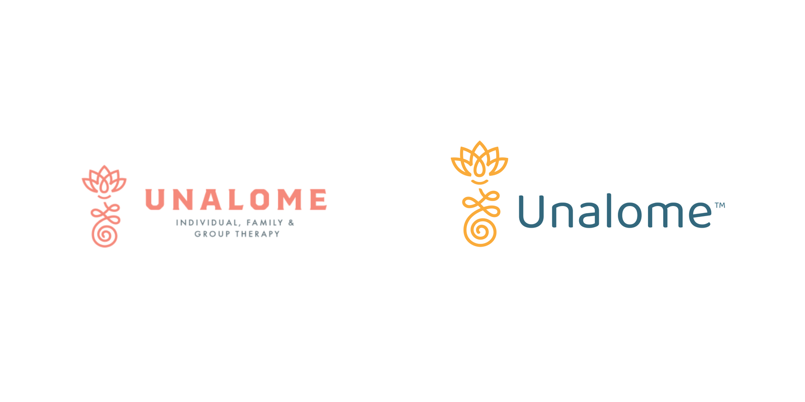
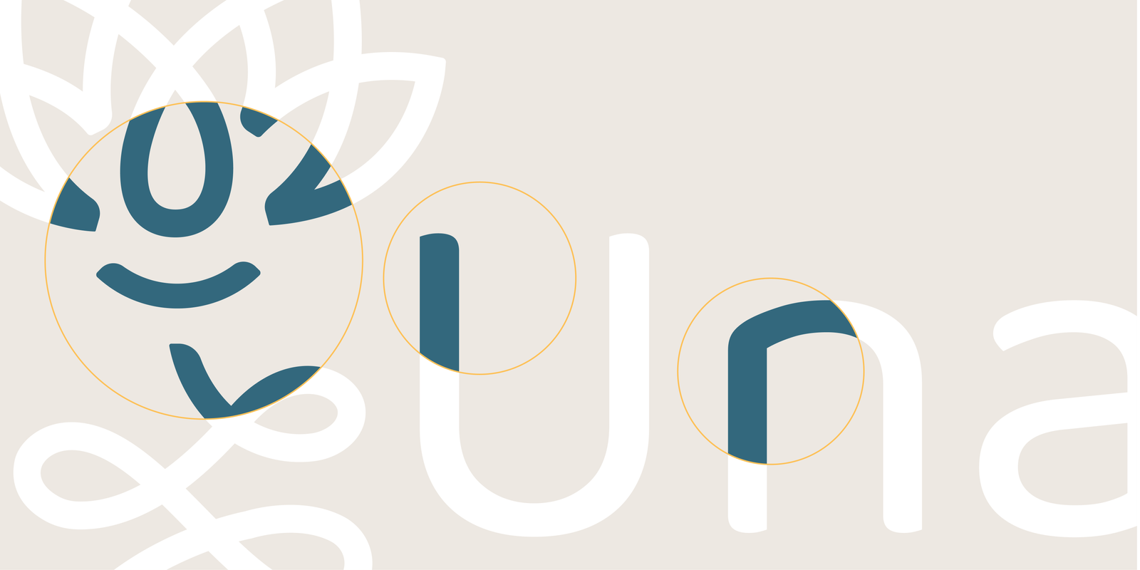
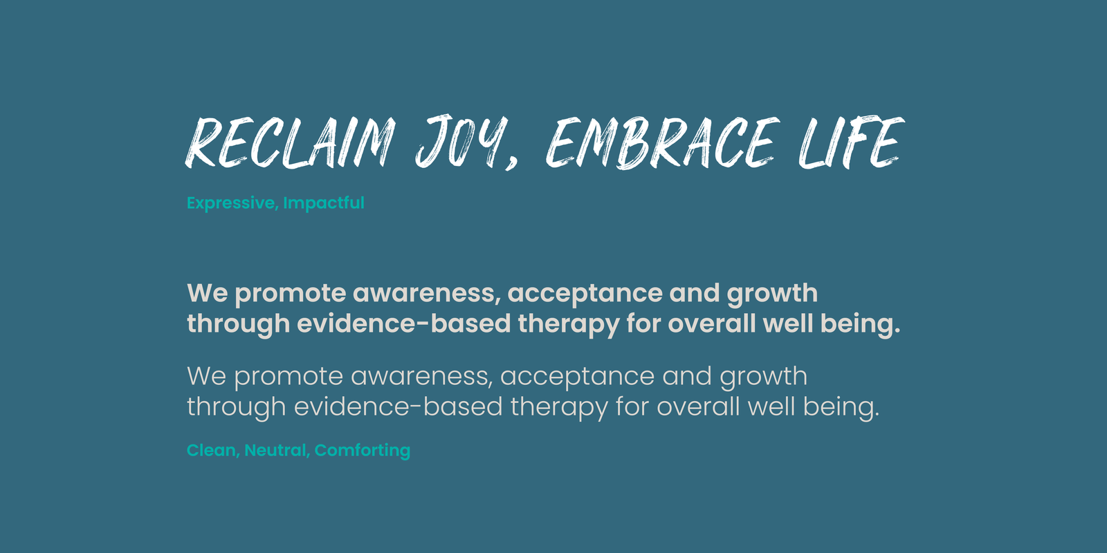
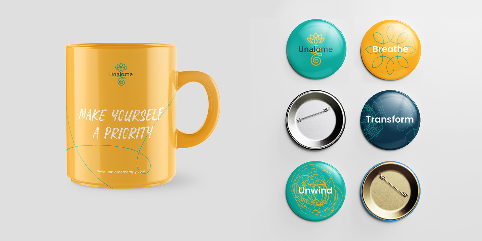
We refreshed their identity without losing the meaning and equity they had built over the years. We softened the sharp edges of the existing design, opting for more rounded, humanist typography that reflected the brand’s compassionate and approachable ethos. The new lock-ups were designed to be fluid, mirroring the continuous, evolving nature of therapy.
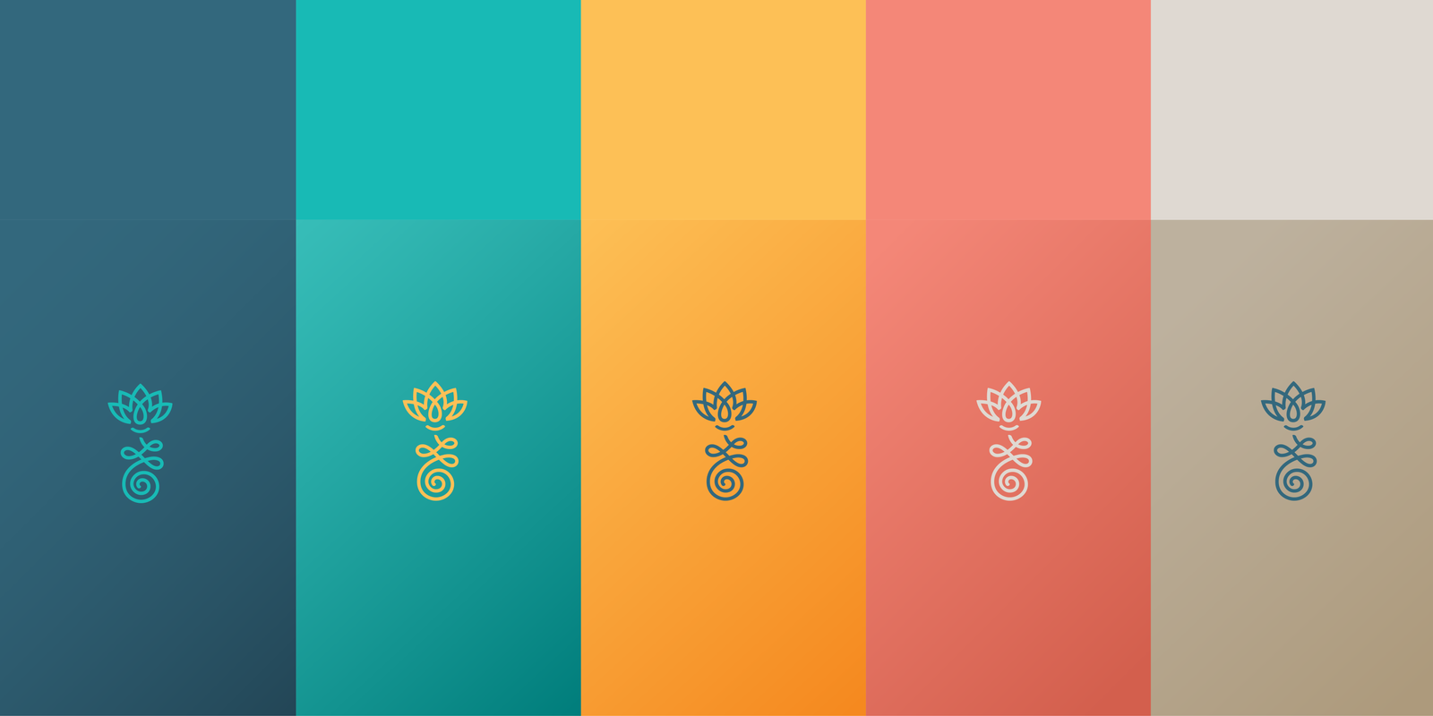
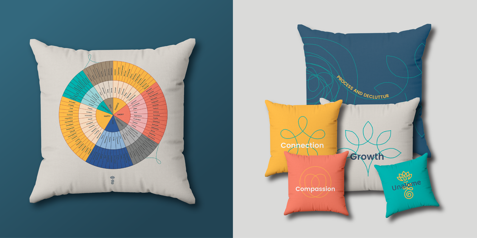
The colour palette for Unalome was thoughtfully selected to reflect the diverse emotional states of the human experience. We chose a dark teal for its depth and seriousness, balanced by a fresh teal to evoke calm and clarity. A vibrant yellow introduced a sense of optimism and energy, while a soft coral provided warmth and approachability. This blend of tones allowed the brand to come across as both welcoming and grounded in the seriousness of its purpose, striking the right balance between compassion and professionalism.

Visual Language: The Thread of Thought
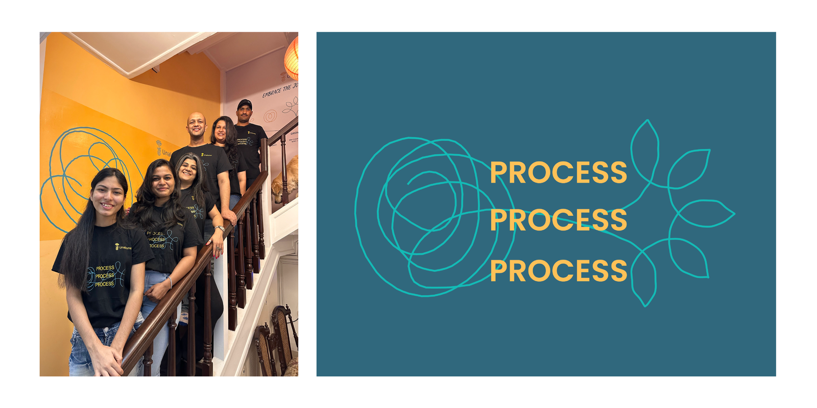
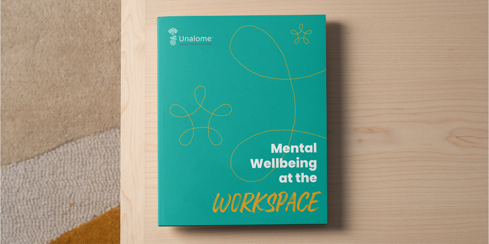
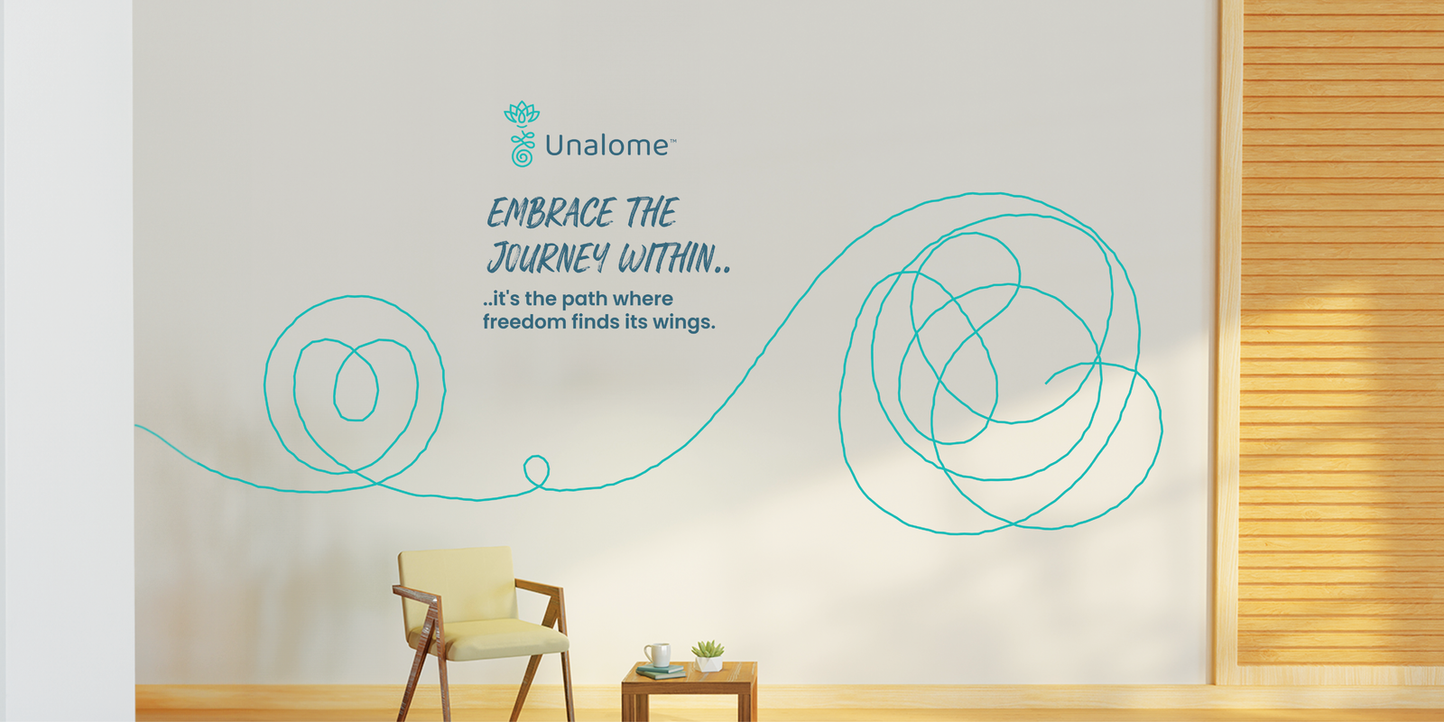
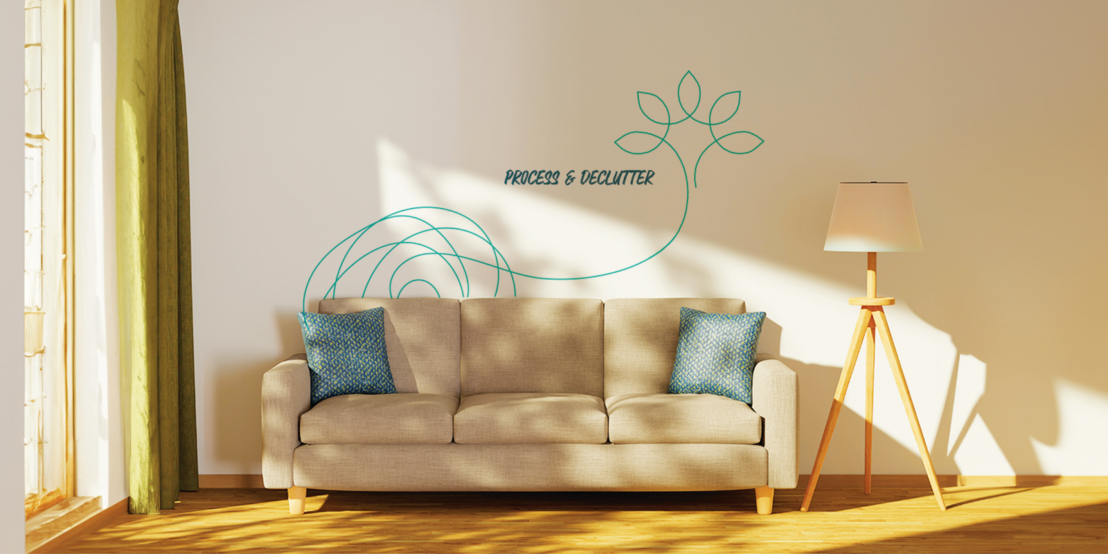
The visual identity drew inspiration from a single thread—symbolising the complexity of our thoughts. Just as our minds can feel tangled and chaotic, therapy helps to unravel and organise these thoughts, allowing us to see them with newfound clarity and beauty. This thread became a key aspect of the brand’s visual style, representing Unalome’s process-driven approach to helping clients make sense of their emotional journey.
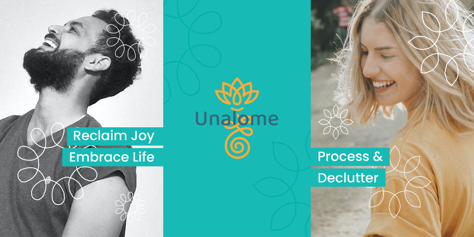
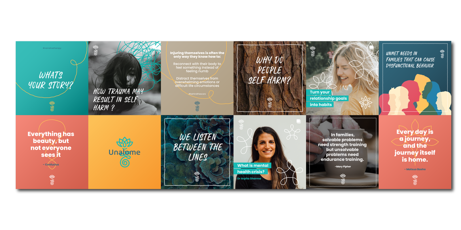
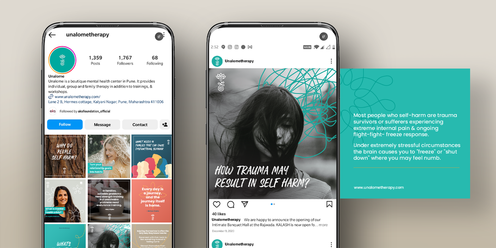

For the brand imagery, we drew inspiration from close-ups of nature—raw, imperfect, and ever-changing. Just like the human mind, nature has its moods, unpredictability, and beauty in imperfection. These natural elements not only mirrored the emotional complexities clients face but also served as a gentle, thoughtful way to communicate difficult or unpleasant messages. By using nature as a visual metaphor, we were able to convey the depth of the therapeutic journey in a way that felt organic and resonant.

The Firebrand team works hard to understand the brand at a conceptual level and really finds a way to translate that onto the design and brand language. Punctual, responsive, understanding, and patient are the first few words that come to mind. Ankita’s team shows that reliability, accountability, and integrity are essential qualities I look for in any collaboration at work. They have truly excelled in these areas. It’s been an absolute pleasure working with Team Firebrand.
Barkha Bajaj
Founder, Clinical Director & Senior Psychotherapist, Unalome
