
Sammey’s
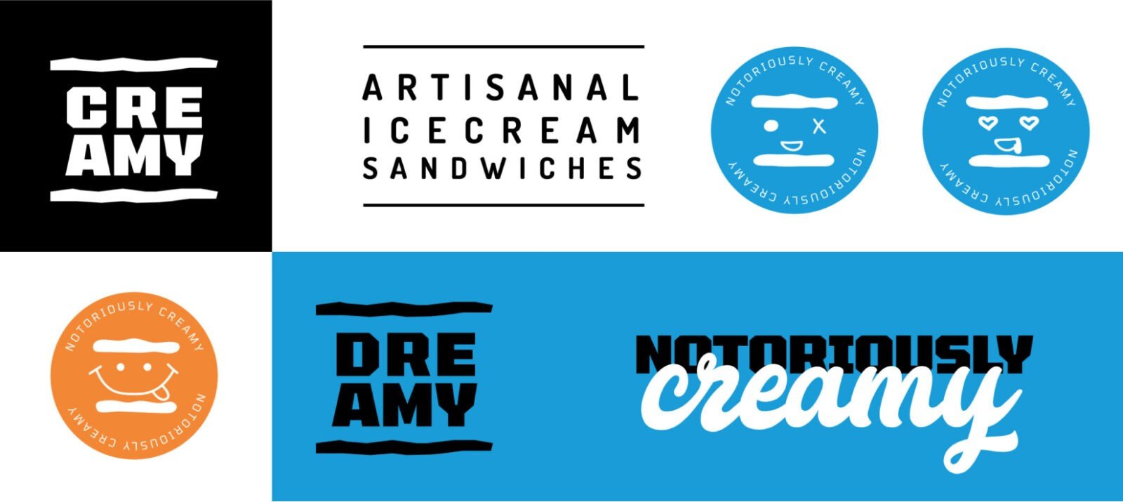
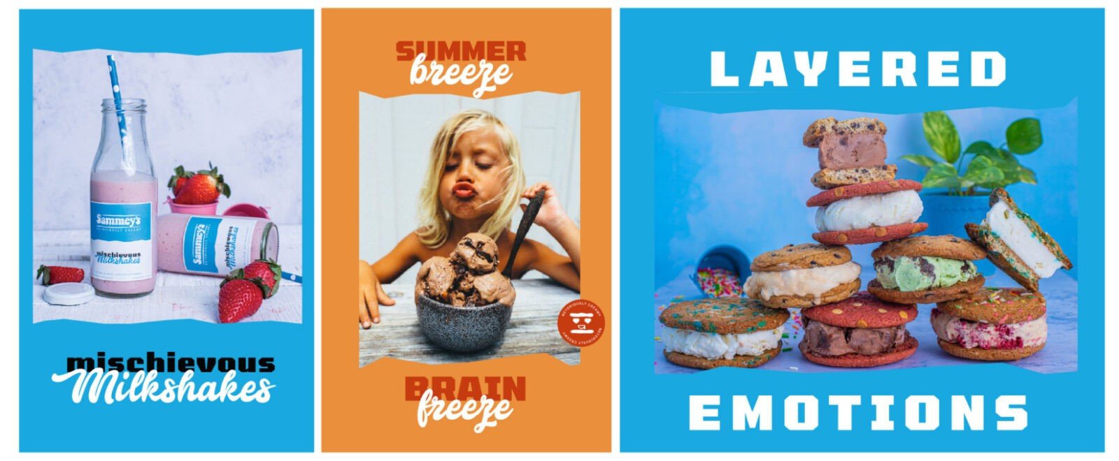
The vision of the brand was to introduce artisanal ice cream sandwiches (sammey’s) and address the dessert segment like no other. Why should one choose between ice cream or cookies, when they can have both? We created an identity that was fun, playful and young. The typeface was “sandwiched” between uneven forms that stood for the handcrafted, uneven cookies that were all made in-house with utmost care.
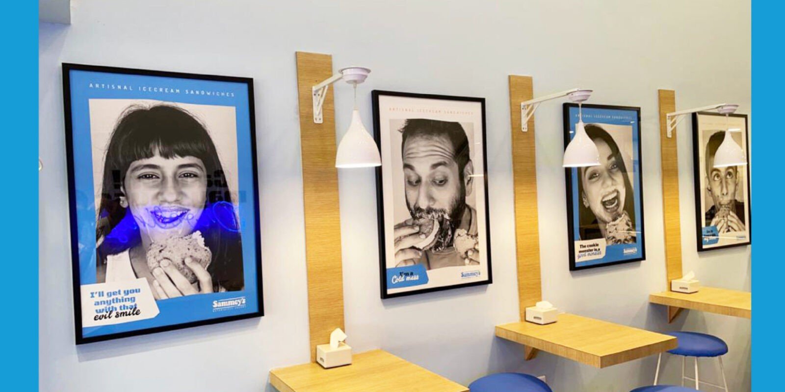
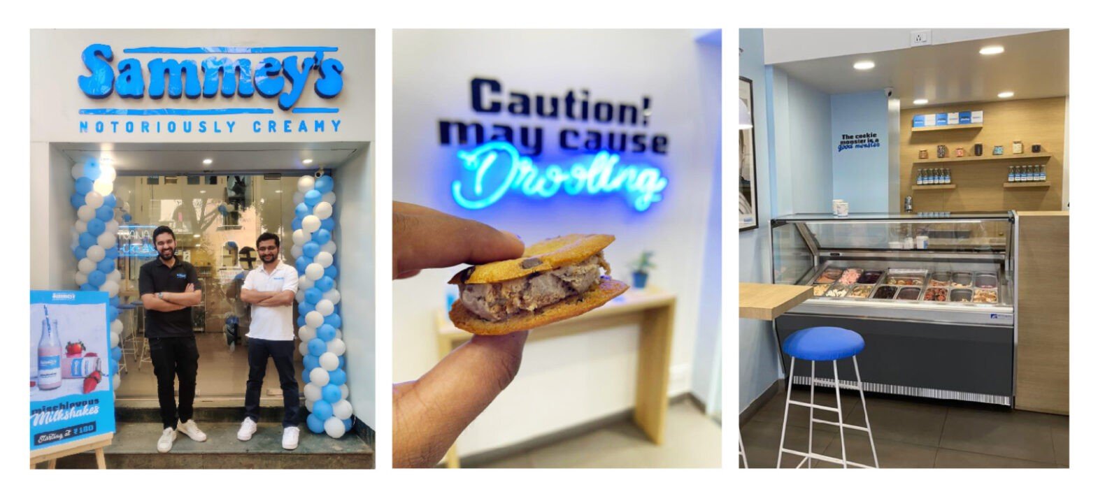
“Notoriously Creamy” the essence we crafted for Sammey’s. It was inspired by the personality behind the brand as well as the extremely creamy nature of the product. The copy played an important role to drive home the personality of the brand. Inspired by popular culture, the messaging was created to connect directly with the brand’s young target groups.
